

— IBX native app Benefits
Modernized the member app to simplify access to care and boost member confidence
Reduced cognitive overload and improved task completion
Role
UX Strategist
Sr UX Designer
Design System Co-Architect
Platform
Native App
Cross-functional Teams
Product
Development
Marketing
— Overview
Independence Blue Cross (IBX) serves millions of members with a digital ecosystem that spans the Member Portal (web) and Native App (iOS/Android). I was tasked with improving the Benefits Experience within the mobile app to help members quickly understand their coverage and costs—areas that historically caused confusion and high call-center volume.
This work aligned with IBX’s broader Digital Front Door strategy, which emphasizes accessibility, multi-brand scalability, and a design system approach to ensure consistency across Independence and AmeriHealth brands.
— the problem
Fragmented Navigation
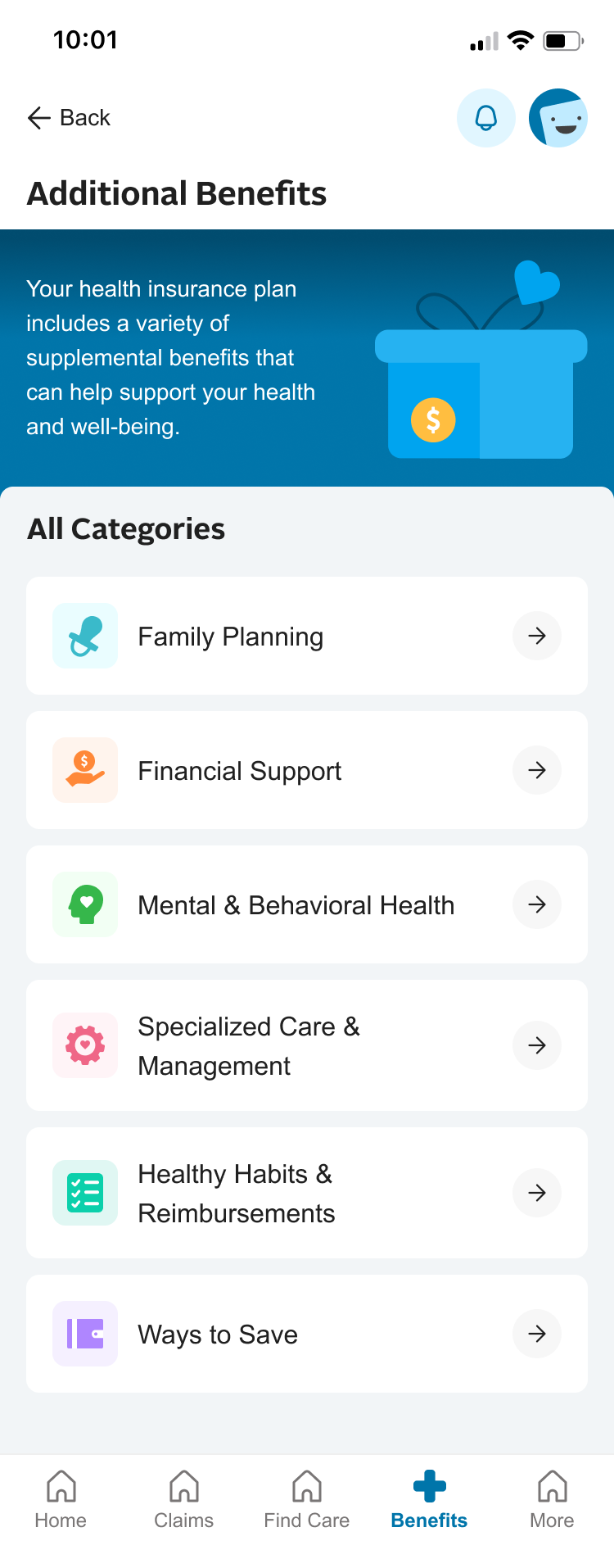
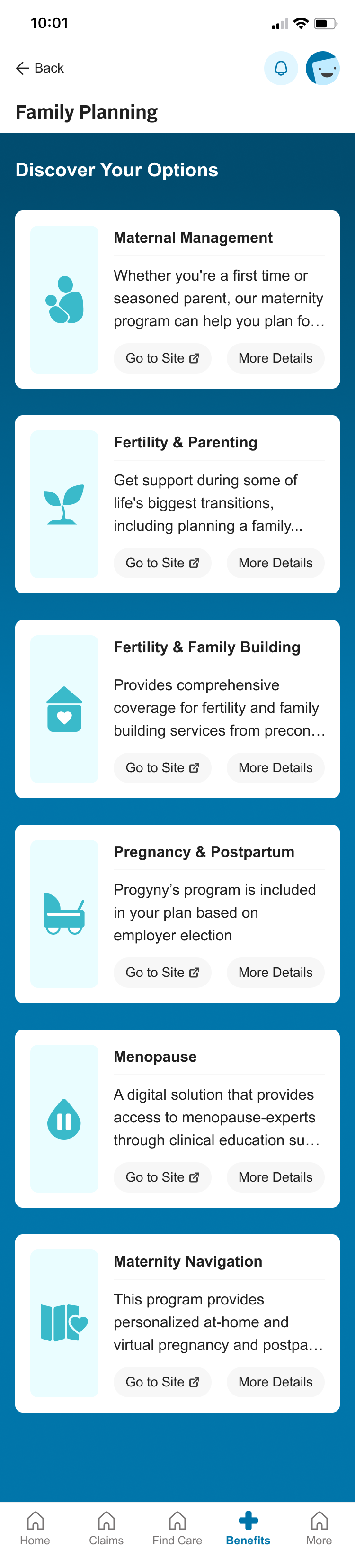
Members struggled to locate benefits information, often unsure whether to go to Coverage & Benefits, Claims, or other navigation items.

Information Overload
Benefits details were often presented in dense tables or long scrolls, requiring extra clicks or calls to clarify.

Lack of Guidance
No clear “what’s next” or breakdown of how to use the coverage for common scenarios.
— Opportunity
How might we create a benefits experience that
simplifies complex
coverage, reduces cognitive overload,
and empowers
members to take
confident next steps in their care?
Fragmented

Unified
Benefits data appears in many formats with different jargon. Members need a simple, clear navigation experience. Members could benefit from consistent patterns.
Overwhelming
Focused
Long scrolls, dense tables, and too many options on one page makes completing tasks too difficult. Members need an easy path towards their end goal.
Directionless
Guided
Members aren’t always sure what to do next after reading benefits. By embedding contextual nudges, we can guide them toward actions with confidence.
— Strategy
Core Principles
We grounded our solution in a set of guiding principles:
- Clarity—Simplify insurance terminology and surface only the most important details upfront.
- Guidance—Embed contextual nudges and next steps to help members act with confidence.
- Scalability—Create and leverage a design system to support multiple brands
- Accessibility—Meet WCAG 2.2 AA standards so every member can access their benefits without barriers.

Process Outline
- Feature Scoping—Collaborate with Product team to define MVP
- Discovery—Leverage member insights, pain points, user journey
- Research—Competitive analysis, best practices
- Ideation—Information Architecture, Usage scenarios, UI Design
- Usability Testing—Evaluate comprehension
- Refine—Iterate on visual hierarchy and guided task prompts
— process

Define—Feature Scoping
- Partnered with the product team to define the MVP for benefits in the native app, focusing on coverage clarity, navigation, and next-step guidance.
- Held stakeholder interviews to understand use case scenarios
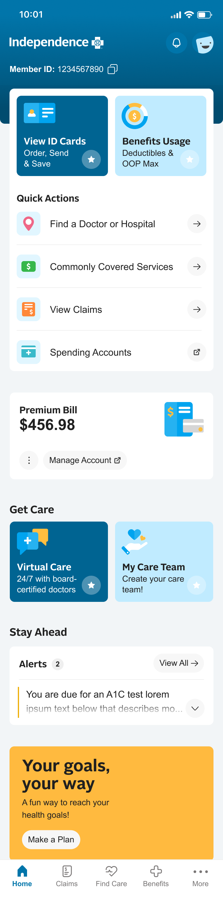
Benefits Overview
Proposed Scope for Native
Original Benefits
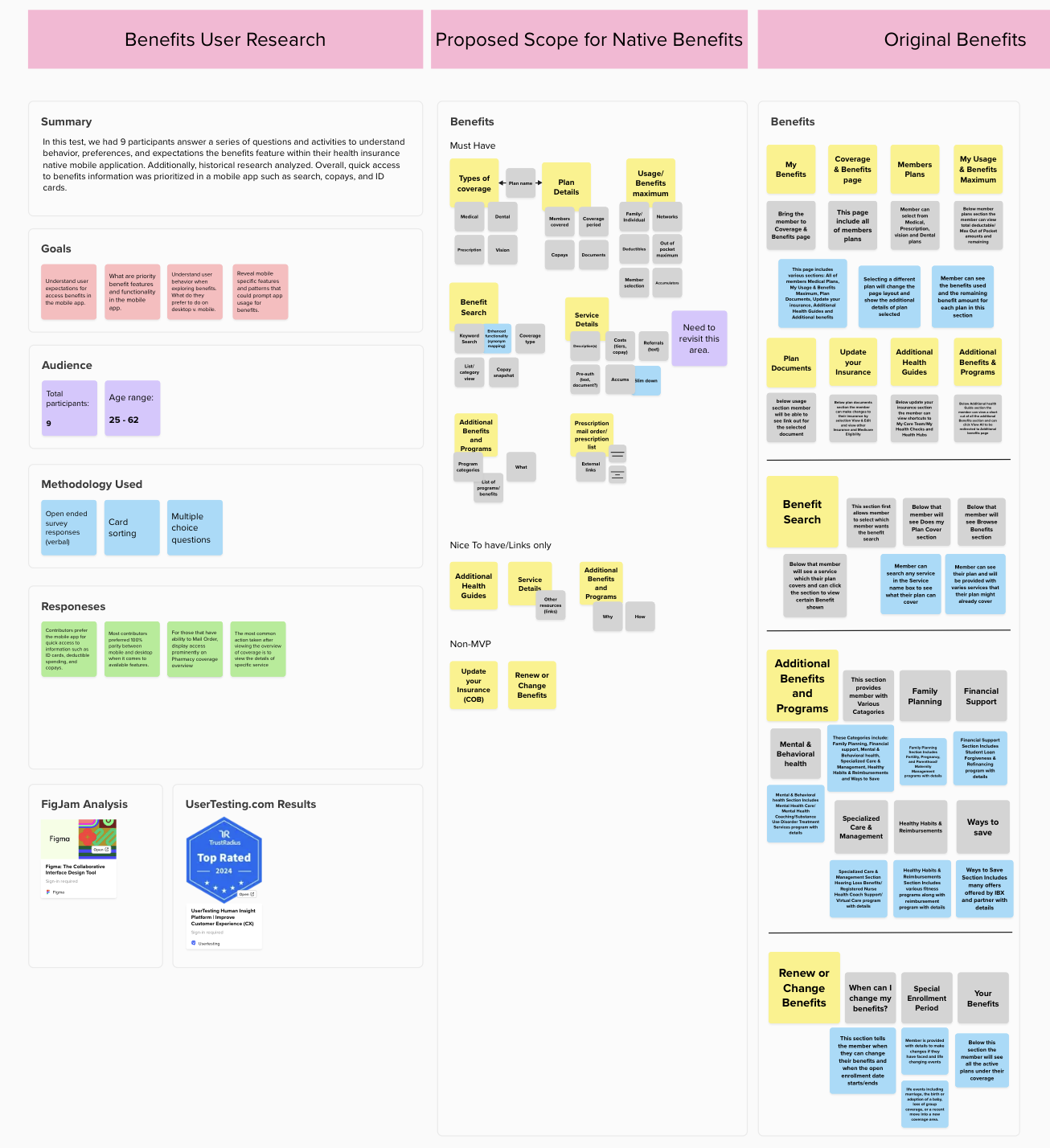
Define—What are the goals?
- Within the Benefits experience, members main goals are to find a cost of a service to ensure it is covered, and then connect with an in-network provider. I mapped the journey for opportunities where we could introduce costs up front and access to care at appropriate times in their journey.
- Another focal point was access to ID cards, so I identified areas where we can give multiple access points to ID Cards.
Discovery: Identifying Pain Points
- Members lacked confidence in their ability to find answers without support because it is overwhelming and difficult to navigate.
- The Benefits experience felt like a mobile site, not an app.
- Search and navigation were not intuitive or reliable.
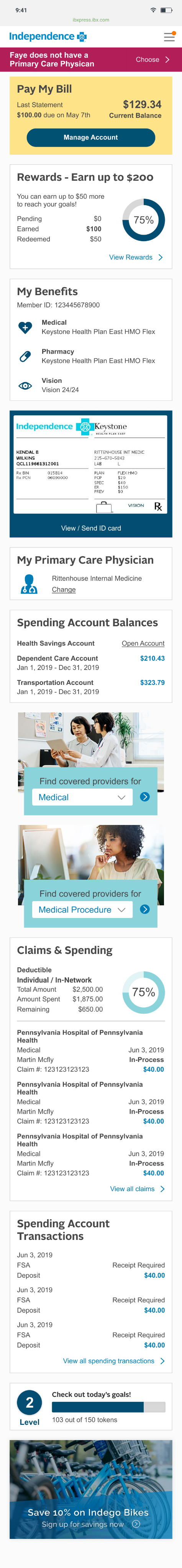
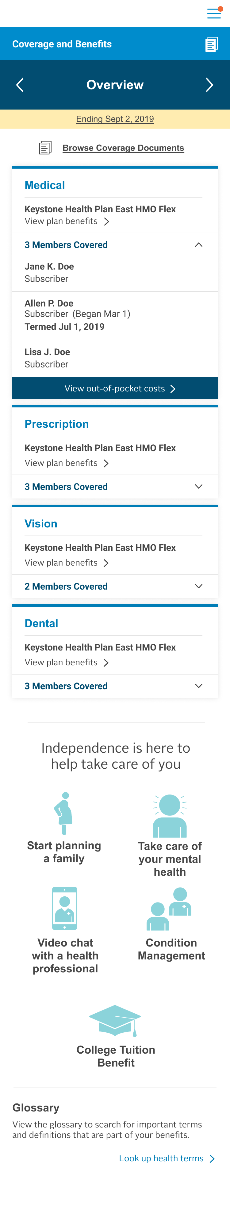
Old Design
Homepage / Dashboard
Benefits are buried deep in from the homepage, and fragmented info makes it difficult to understand
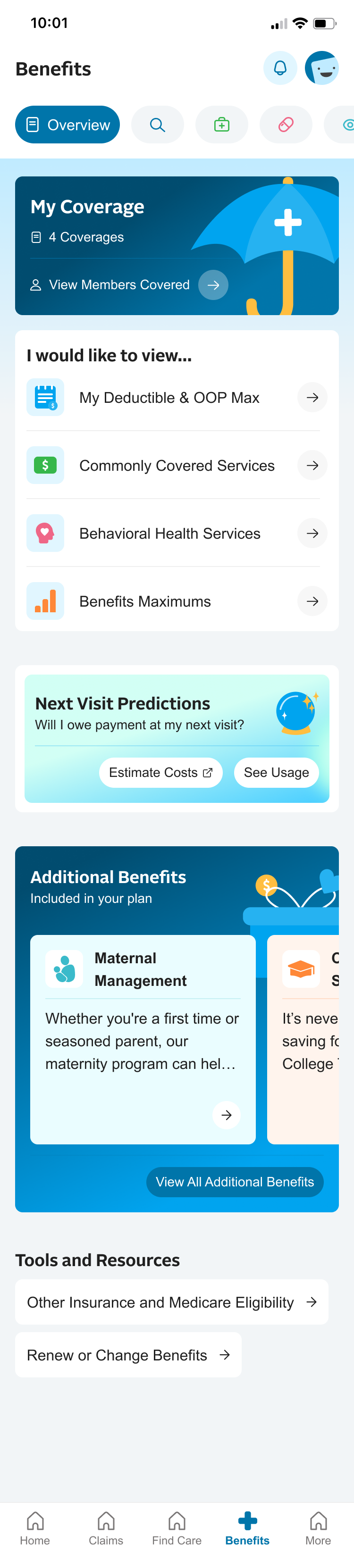
Benefits - Overview
Overview page only shows members covered. Members want to get to coverage information faster.
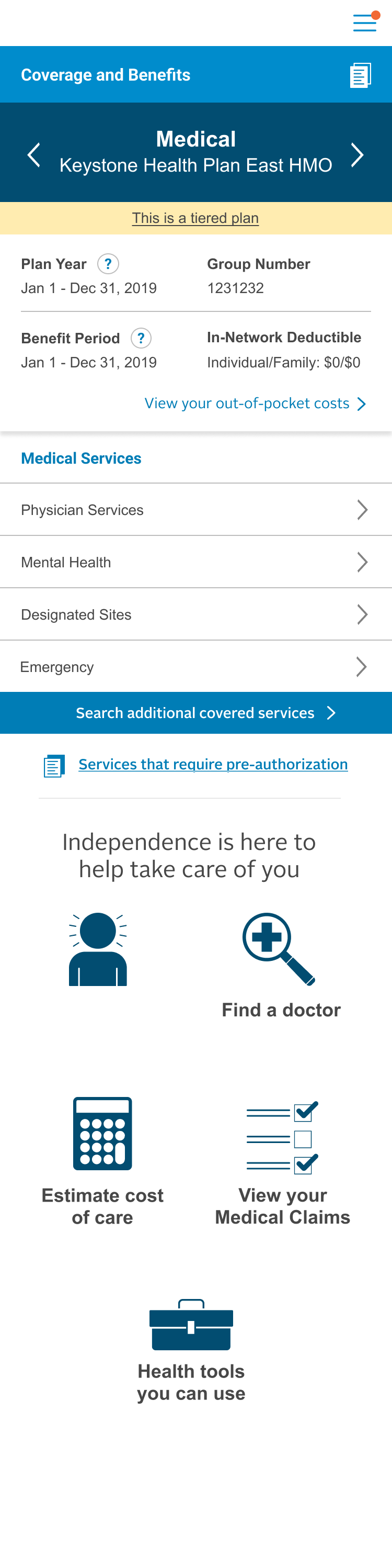
Benefits - Medical
Members are unsure of what to do next after reading info, or how it works altogether.
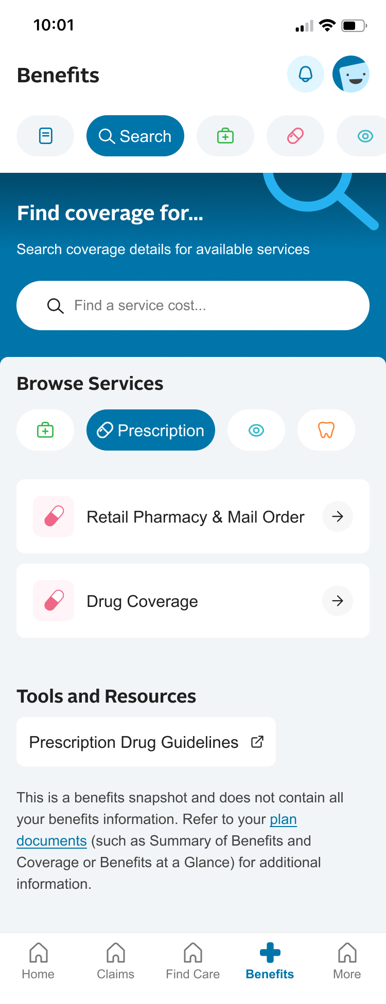
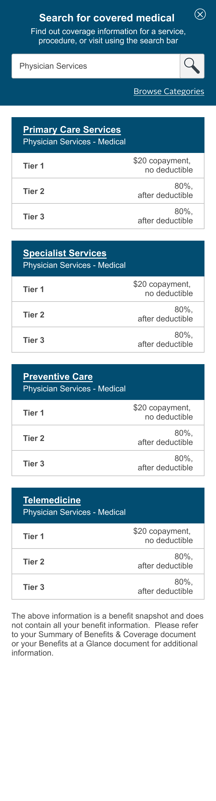
Benefits - Search
Confusion around what tiers are, if they are viewing in-network, and no direction for next steps. Info overload.

Research
- Researched how competitors simplify benefits.
- Extracted best practices in progressive disclosure, plain language, and action-oriented benefits flows.
Progressive Disclosure
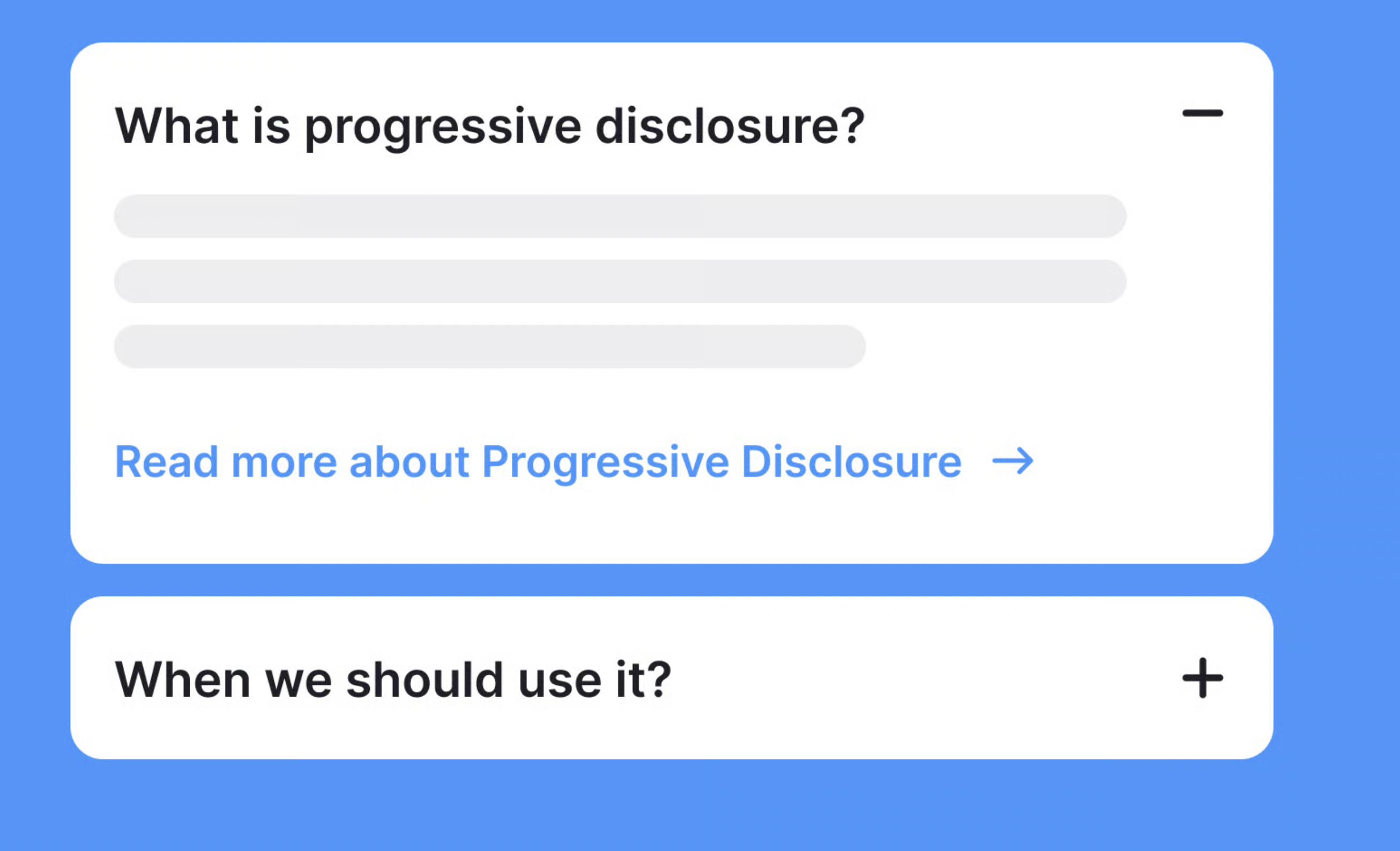
Action-Oriented Flow
Display
Action

Decision


Ideation
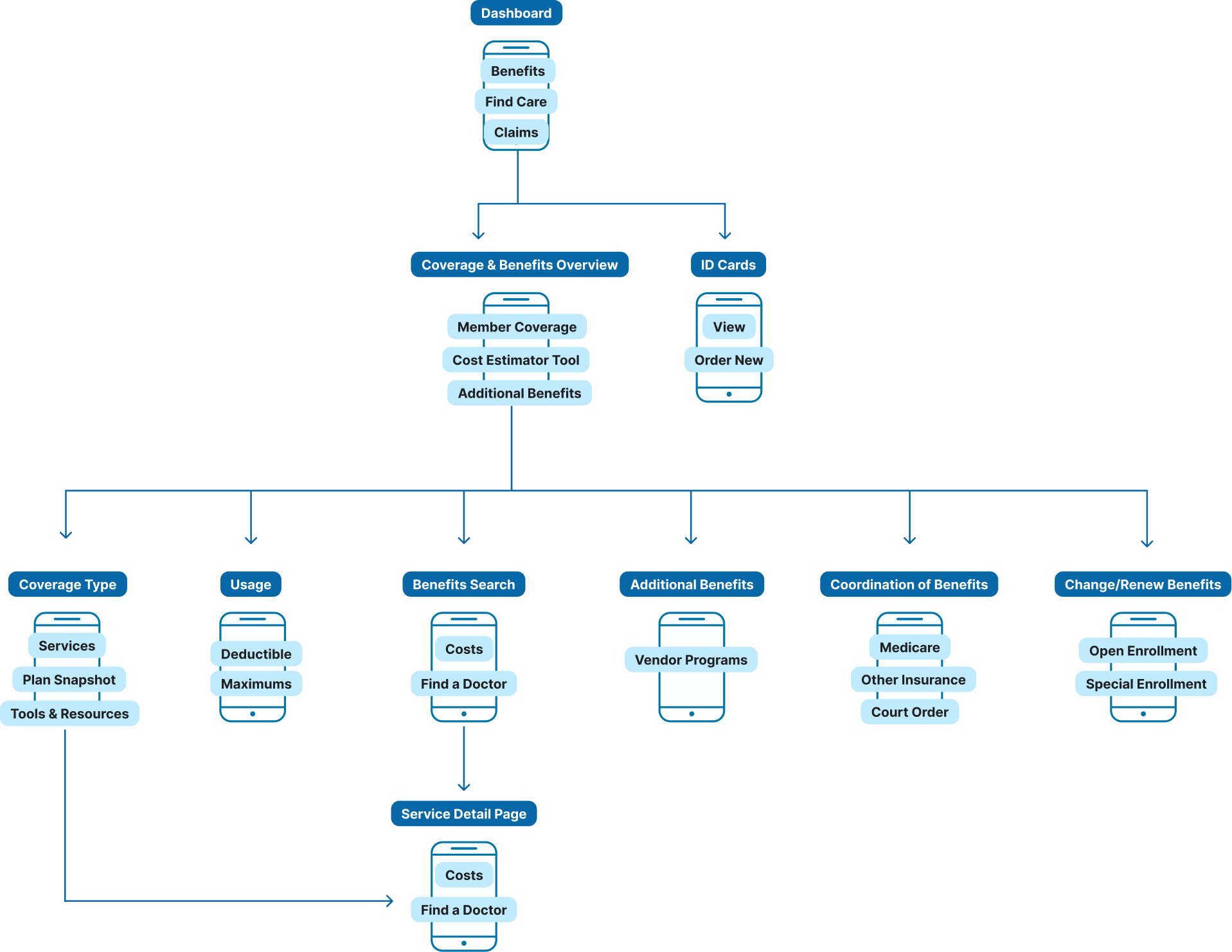
- Re-structured the information architecture to consolidate fragmented entry points.
- Designed usage scenarios and UI flows that surfaced high-level benefits first, with drill-down options for detail.
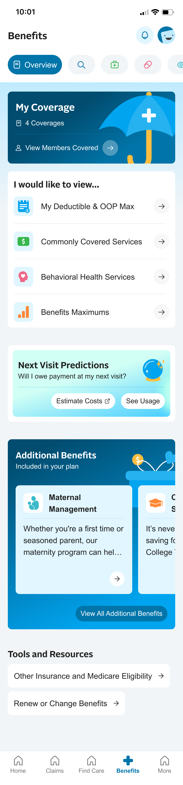
Plan Types
Members Covered
Overview
Medical
Rx
Vision

ID Cards
Search Benefits
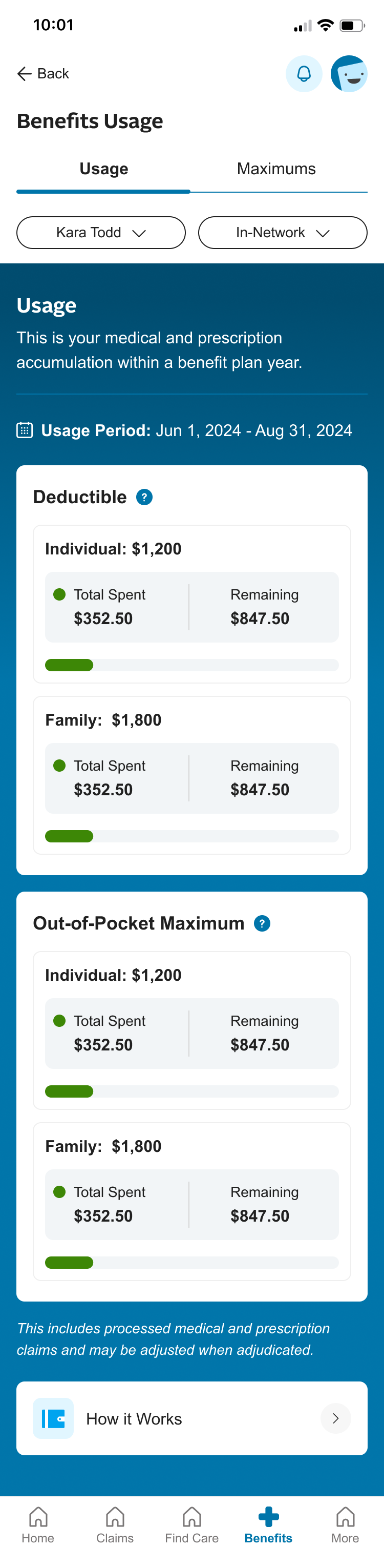
Benefits Maximums
Estimate Costs
Additional
Benefits
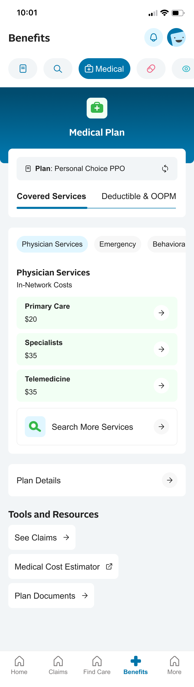
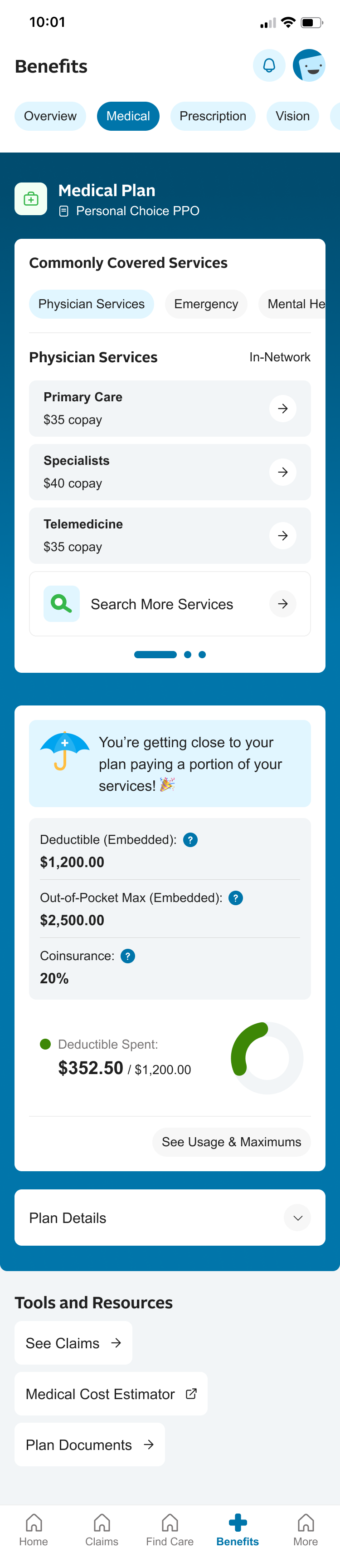
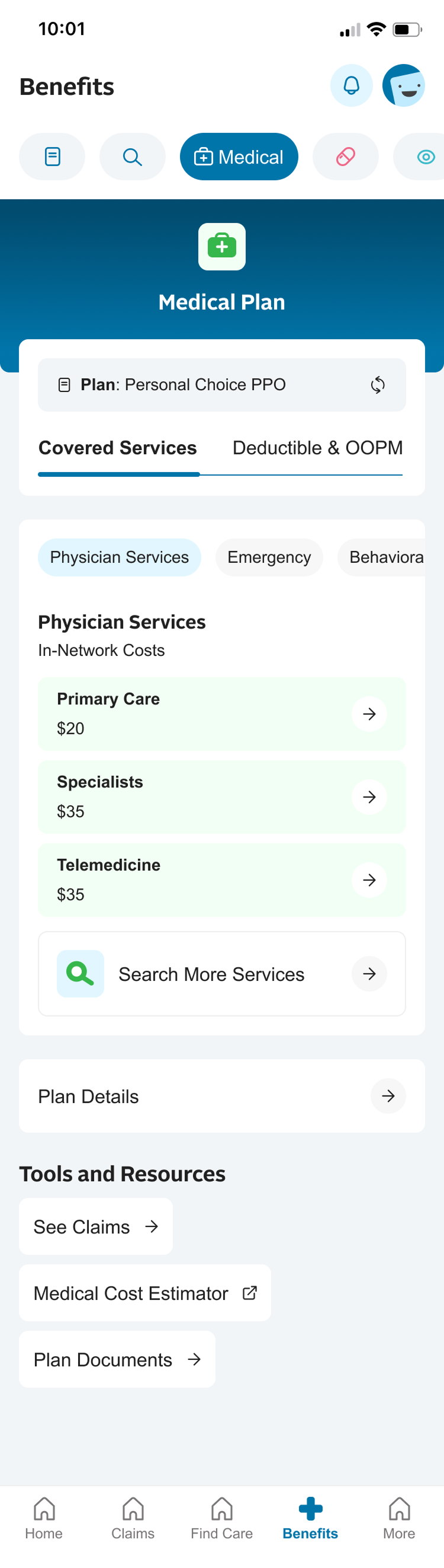
Covered Services
Physician Services
Overview
Medical
Rx
Vision
Primary Care - $35
Deductible
$1,200
Out-of-Pocket Max
$2,500
Specialists - $40
Telemedicine - $35
Physician Services
Dedicated benefits
navigation to toggle
plans.
Different service
categories and copay
information upfront,
then drills down into
more details.
Plan snapshot,
which leads out to
a dedicated Usage
page.

Usability Testing
- I tested prototypes with members to evaluate comprehension, navigation efficiency, and confidence in taking next steps.
- While users enjoyed the new experience, they were still overwhelmed by the organization of options. Using prompted language such as “I would like to” tested high with competitors as well as our testers.
- Moving search to the top of the menu allowed users to find it faster, while still allowing common tasks to still display in the main area.
- I re-framed Cost Estimates and Usage as “Next Visit Predictions” as members typically are looking at these features because they want to understand what their out of pocket costs will be for their next service. This allows for a more task-oriented flow.
Before Testing
After Testing
Task-oriented flow
and uniform visual cues
Reframed Cost Estimates
and Usage as a task prompt
instead of links
Providing a preview
of supplemental benefits
instead of listing it out as
just a link

Before Testing
After Testing
Tab nav instead of
stacking the information
Refinement
- Iterated on terminology, visual hierarchy, and guided task prompts
- Validated against compliance and accessibility requirements before handoff
— Outcome
User Satisfaction
Reduced cognitive overload and increased task completion


— next steps
Phased improvements
While the overall benefits experience is tremendously better than the previous version, there is opportunity to make external partners which we link out a lot of the experience to, feel much more integrated and seamless. There will need to be certain API work to establish these experiences for members.


— IBX native app Benefits
Modernized the member app to simplify access to care and boost member confidence
Reduced cognitive overload and improved task completion
Role
UX Strategist
Sr UX Designer
Design System Co-Architect
Platform
Native App
Cross-functional Teams
Product
Development
Marketing
— Overview
Independence Blue Cross (IBX) serves millions of members with a digital ecosystem that spans the Member Portal (web) and Native App (iOS/Android). I was tasked with improving the Benefits Experience within the mobile app to help members quickly understand their coverage and costs—areas that historically caused confusion and high call-center volume.
This work aligned with IBX’s broader Digital Front Door strategy, which emphasizes accessibility, multi-brand scalability, and a design system approach to ensure consistency across Independence and AmeriHealth brands.
— the problem
Fragmented Navigation
Members struggled to locate benefits information, often unsure whether to go to Coverage & Benefits, Claims, or other navigation items.
Information Overload
Benefits details were often presented in dense tables or long scrolls, requiring extra clicks or calls to clarify.

Lack of Guidance
No clear “what’s next” or breakdown of how to use the coverage for common scenarios.
— Opportunity
How might we create a benefits experience that simplifies complex
coverage, reduces cognitive overload,
and empowers
members to take
confident next steps in their care?
Fragmented
Unified
Benefits data appears in many formats with different jargon. Members need a simple, clear navigation experience. Members could benefit from consistent patterns.
Overwhelming
Focused
Long scrolls, dense tables, and too many options on one page makes completing tasks too difficult. Members need an easy path towards their end goal.
Directionless
Guided
Members aren’t always sure what to do next after reading benefits. By embedding contextual nudges, we can guide them toward actions with confidence.
— Strategy
Core Principles
We grounded our solution in a set of guiding principles:
- Clarity—Simplify insurance terminology and surface only the most important details upfront.
- Guidance—Embed contextual nudges and next steps to help members act with confidence.
- Scalability—Create and leverage a design system to support multiple brands
- Accessibility—Meet WCAG 2.2 AA standards so every member can access their benefits without barriers.

Process Outline
- Feature Scoping—Collaborate with Product team to define MVP
- Discovery—Leverage member insights, pain points, user journey
- Research—Competitive analysis, best practices
- Ideation—Information Architecture, Usage scenarios, UI Design
- Usability Testing—Evaluate comprehension
- Refine—Iterate on visual hierarchy and guided task prompts
— process
Define—Feature Scoping
- Partnered with the product team to define the MVP for benefits in the native app, focusing on coverage clarity, navigation, and next-step guidance.
- Held stakeholder interviews to understand use case scenarios
Benefits Overview
Proposed Scope for Native
Original Benefits
Define—What are the goals?
- Within the Benefits experience, members main goals are to find a cost of a service to ensure it is covered, and then connect with an in-network provider. I mapped the journey for opportunities where we could introduce costs up front and access to care at appropriate times in their journey.
- Another focal point was access to ID cards, so I identified areas where we can give multiple access points to ID Cards.
Discovery: Identifying Pain Points
- Members lacked confidence in their ability to find answers without support because it is overwhelming and difficult to navigate.
- The Benefits experience felt like a mobile site, not an app.
- Search and navigation were not intuitive or reliable.
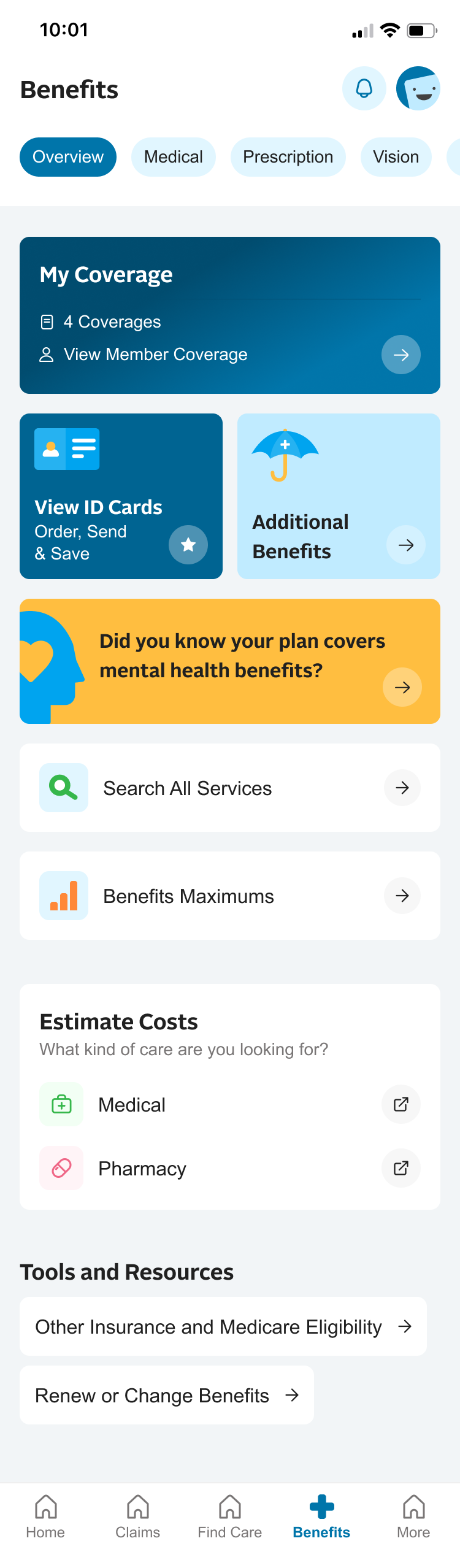
Old Design
Homepage / Dashboard
Benefits are buried deep in from the homepage, and fragmented info makes it difficult to understand
Benefits - Overview
Overview page only shows members covered. Members want to get to coverage information faster.
Benefits - Medical
Members are unsure of what to do next after reading info, or how it works altogether.
Benefits - Search
Confusion around what tiers are, if they are viewing in-network, and no direction for next steps. Info overload.
Research
- Researched how competitors simplify benefits.
- Extracted best practices in progressive disclosure, plain language, and action-oriented benefits flows.
Progressive Disclosure
Action-Oriented Flow
Display
Action
Decision
Ideation
- Re-structured the information architecture to consolidate fragmented entry points.
- Designed usage scenarios and UI flows that surfaced high-level benefits first, with drill-down options for detail.
Plan Types
Members Covered
Overview
Medical
Rx
Vision
ID Cards
Search Benefits
Benefits Maximums
Estimate Costs
Additional
Benefits
Covered Services
Physician Services
Overview
Medical
Rx
Vision
Primary Care - $35
Deductible
$1,200
Out-of-Pocket Max
$2,500
Specialists - $40
Telemedicine - $35
Physician Services
Dedicated benefits
navigation to toggle
plans.
Different service
categories and copay
information upfront,
then drills down into
more details.
Plan snapshot,
which leads out to
a dedicated Usage
page.
Usability Testing
- I tested prototypes with members to evaluate comprehension, navigation efficiency, and confidence in taking next steps.
- While users enjoyed the new experience, they were still overwhelmed by the organization of options. Using prompted language such as “I would like to” tested high with competitors as well as our testers.
- Moving search to the top of the menu allowed users to find it faster, while still allowing common tasks to still display in the main area.
- I re-framed Cost Estimates and Usage as “Next Visit Predictions” as members typically are looking at these features because they want to understand what their out of pocket costs will be for their next service. This allows for a more task-oriented flow.
Before Testing
After Testing
Task-oriented flow
and uniform visual cues
Reframed Cost Estimates
and Usage as a task prompt
instead of links
Providing a preview
of supplemental benefits
instead of listing it out as
just a link
Before Testing
After Testing
Tab nav instead of
stacking the information
Refinement
- Iterated on terminology, visual hierarchy, and guided task prompts
- Validated against compliance and accessibility requirements before handoff
— Outcome
User Satisfaction
Reduced cognitive overload and increased task completion
— next steps
Phased improvements
While the overall benefits experience is tremendously better than the previous version, there is opportunity to make external partners which we link out a lot of the experience to, feel much more integrated and seamless. There will need to be certain API work to establish these experiences for members.
— IBX native app Benefits
Modernized the member app to simplify access to care and boost member confidence
Reduced cognitive overload and improved task completion
Role
UX Strategist
Sr UX Designer
Design System Co-Architect
Platform
Native App
Cross-functional Teams
Product
Development
Marketing
— Overview
Independence Blue Cross (IBX) serves millions of members with a digital ecosystem that spans the Member Portal (web) and Native App (iOS/Android). I was tasked with improving the Benefits Experience within the mobile app to help members quickly understand their coverage and costs—areas that historically caused confusion and high call-center volume.
This work aligned with IBX’s broader Digital Front Door strategy, which emphasizes accessibility, multi-brand scalability, and a design system approach to ensure consistency across Independence and AmeriHealth brands.
— the problem
Fragmented Navigation
- Members struggled to locate benefits information, often unsure whether to go to Coverage & Benefits, Claims, or other navigation items.

Information Overload
- Benefits details were often presented in dense tables or long scrolls, requiring extra clicks or calls to clarify.

Lack of Guidance
- No clear “what’s next” or breakdown of how to use the coverage for common scenarios.
— Opportunity
How might we create a benefits experience that
simplifies complex coverage,
reduces cognitive overload
and
empowers members to take
confident next steps in their care?
Fragmented
Unified
Benefits data appears in many formats with different jargon. Members need a simple, clear navigation experience. Members could benefit from consistent patterns.
Overwhelming
Focused
Long scrolls, dense tables, and too many options on one page makes completing tasks too difficult. Members need an easy path towards their end goal.
Directionless
Guided
Members aren’t always sure what to do next after reading benefits. By embedding contextual nudges, we can guide them toward actions with confidence.
— Strategy
Core Principles
We grounded our solution in a set of guiding principles:
- Clarity—Simplify insurance terminology and surface only the most important details upfront.
- Guidance—Embed contextual nudges and next steps to help members act with confidence.
- Scalability—Create and leverage a design system to support multiple brands
- Accessibility—Meet WCAG 2.2 AA standards so every member can access their benefits without barriers.

Process Outline
- Feature Scoping—Collaborate with Product team to define MVP
- Discovery—Leverage member insights, pain points, user journey
- Research—Competitive analysis, best practices
- Ideation—Information Architecture, Usage scenarios, UI Design
- Usability Testing—Evaluate comprehension
- Refine—Iterate on visual hierarchy and guided task prompts
— process
Define—Feature Scoping
- Partnered with the product team to define the MVP for benefits in the native app, focusing on coverage clarity, navigation, and next-step guidance.
- Held stakeholder interviews to understand use case scenarios
Benefits Overview
Proposed Scope for Native
Original Benefits
Define—What are the goals?
- Within the Benefits experience, members main goals are to find a cost of a service to ensure it is covered, and then connect with an in-network provider. I mapped the journey for opportunities where we could introduce costs up front and access to care at appropriate times in their journey.
- Another focal point was access to ID cards, so I identified areas where we can give multiple access points to ID Cards.
Discovery: Identifying Pain Points
- Members lacked confidence in their ability to find answers without support because it is overwhelming and difficult to navigate.
- The Benefits experience felt like a mobile site, not an app.
- Search and navigation were not intuitive or reliable.
Homepage / Dashboard
Benefits are buried deep in from the homepage, and fragmented info makes it difficult to understand
Old Design
Benefits - Overview
Overview page only shows members covered. Members want to get to coverage information faster.
Benefits - Medical
Members are unsure of what to do next after reading info, or how it works altogether.
Benefits - Search
Confusion around what tiers are, if they are viewing in-network, and no direction for next steps. Info overload.
Research
- Researched how competitors simplify benefits.
- Extracted best practices in progressive disclosure, plain language, and action-oriented benefits flows.
Progressive Disclosure
Action-Oriented Flow
Display
Action

Decision


Ideation
- Re-structured the information architecture to consolidate fragmented entry points.
- Designed usage scenarios and UI flows that surfaced high-level benefits first, with drill-down options for detail.
Plan Types
Members Covered
Overview
Medical
Rx
Vision
ID Cards
Search Benefits
Benefits Maximums
Estimate Costs
Additional
Benefits
Covered Services
Physician Services
Overview
Medical
Rx
Vision
Primary Care - $35
Deductible
$1,200
Out-of-Pocket Max
$2,500
Specialists - $40
Telemedicine - $35
Physician Services
Dedicated benefits
navigation to toggle
plans.
Different service
categories and copay
information upfront,
then drills down into
more details.
Plan snapshot,
which leads out to
a dedicated Usage
page.
Usability Testing
- I tested prototypes with members to evaluate comprehension, navigation efficiency, and confidence in taking next steps.
- While users enjoyed the new experience, they were still overwhelmed by the organization of options. Using prompted language such as “I would like to” tested high with competitors as well as our testers.
- Moving search to the top of the menu allowed users to find it faster, while still allowing common tasks to still display in the main area.
- I re-framed Cost Estimates and Usage as “Next Visit Predictions” as members typically are looking at these features because they want to understand what their out of pocket costs will be for their next service. This allows for a more task-oriented flow.
Before Testing
After Testing
Task-oriented flow
and uniform visual cues
Reframed Cost Estimates
and Usage as a task prompt
instead of links
Providing a preview
of supplemental benefits
instead of listing it out as
just a link
Before Testing
After Testing
Tab nav instead of
stacking the information
Refinement
- Iterated on terminology, visual hierarchy, and guided task prompts
- Validated against compliance and accessibility requirements before handoff
— Outcome
User Satisfaction
Reduced cognitive overload and increased task completion

— next steps
Phased improvements
While the overall benefits experience is tremendously better than the previous version, there is opportunity to make external partners which we link out a lot of the experience to, feel much more integrated and seamless. There will need to be certain API work to establish these experiences for members.