

— IBX Member Portal design system
Redesigning member portal with a scalable design system that standardized patterns and components
Sped up multi-team production and reduced customer service calls
Role
UX Strategist
Implementation Lead & Scaler
Product Designer
Platform
Desktop Web App
Mobile Web
Cross-functional Teams
Product
Development
Marketing
— Overview
Independence Blue Cross (IBX) needed a scalable, consistent way to deliver digital experiences across their member-facing web products. I contributed to evolving and expanding an existing design system—refining components, improving documentation, and enabling designers and developers to work more efficiently.
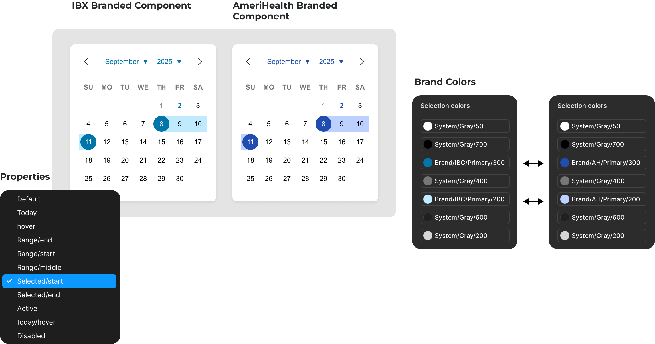
We needed to deliver a system that supports 1:1 component parity across all Independence and AmeriHealth brands.
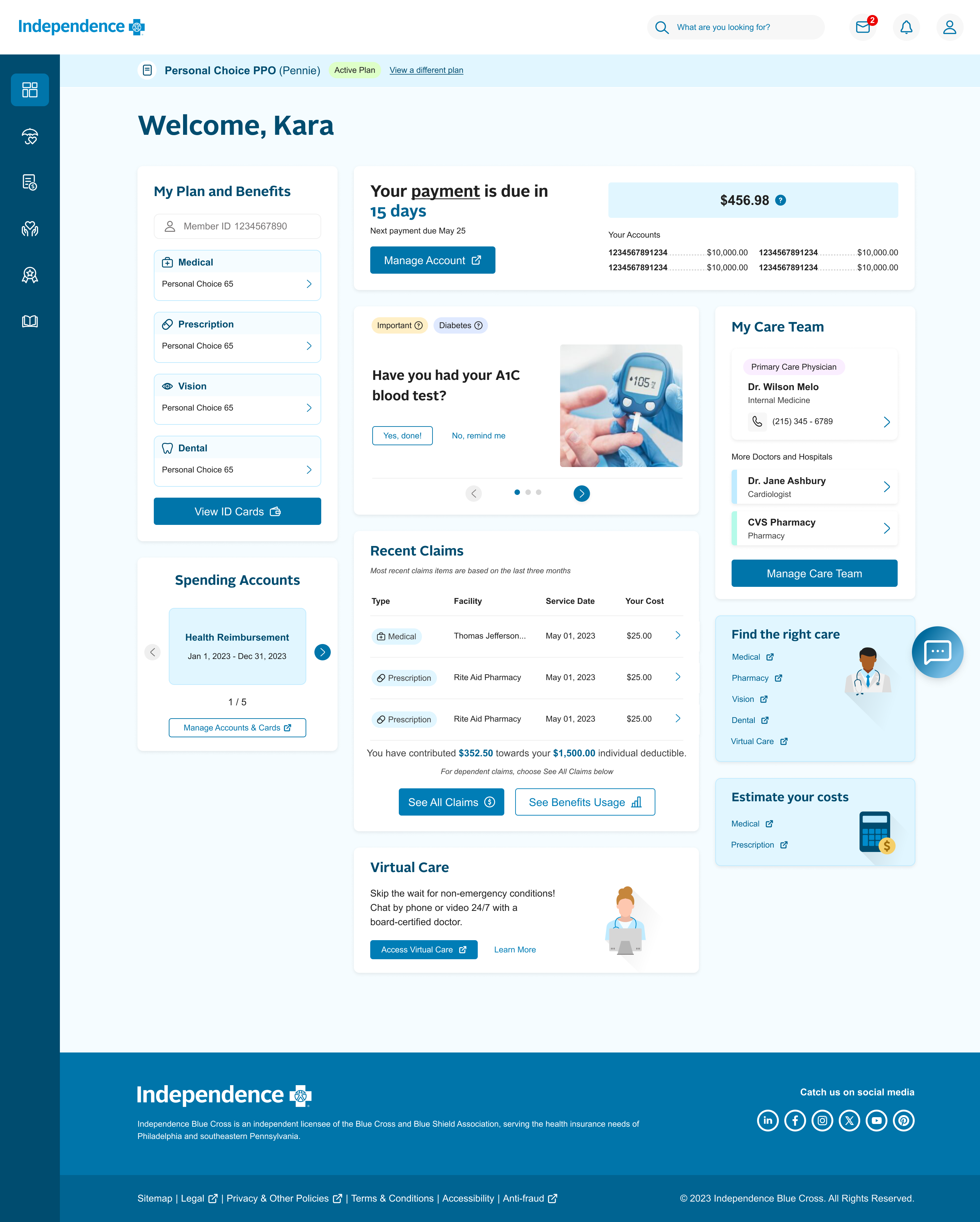
The result was a shared library of UI patterns and guidelines that accelerated delivery and ensured a cohesive experience for all members.
— the problem

Slow design and development cycles
Teams repeatedly built similar components from scratch across brands, with no 1:1 parity. This led to longer handoffs, and redundant work.

Limited documentation and knowledge sharing
Team members had to hunt through files, emails and messages to find specs.
Knowledge was silo’d, making scaling efforts across teams difficult. Teams lacked living documentation to guide consistent navigation and component parity.

Inconsistent member experience
Members faced inconsistent navigation and UI, making it difficult to navigate the portal and trust and use the portal with ease.
— Opportunity
How might we create a system that supports
multi-brand styling
consistent patterns,
and
streamlines
development
Slow

Faster
Designers and Developers need a consistent library and semantic naming to easily theme brand experiences.
Limited
Efficient
Teams need a living documentation hub that explains usage, states, navigation patterns, and edge cases for each component.
Inconsistent
Consistent
Members need seamless, reliable navigation and a unified look and feel to complete tasks with confidence.
— Strategy
Core Principles
We grounded our solution in a set of guiding principles:
- Parity—Ensure 1:1 component alignment across brands.
- Scalability—Create a reusable foundation through libraries and tokens to support multiple brands.
- Consistency—Deliver predictable navigation patterns and UI.
- Efficiency—Reduce duplicate work and accelerate delivery with a single source of truth.
- Accessibility—Meet WCAG 2.2 AA standards to ensure usability for all members.

Conduct Audit
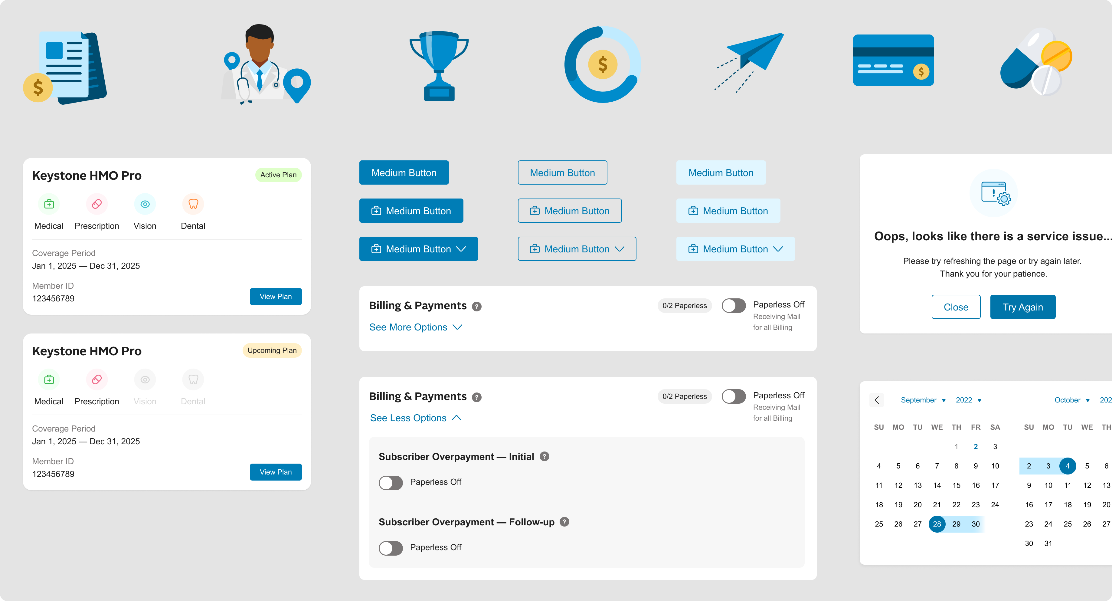
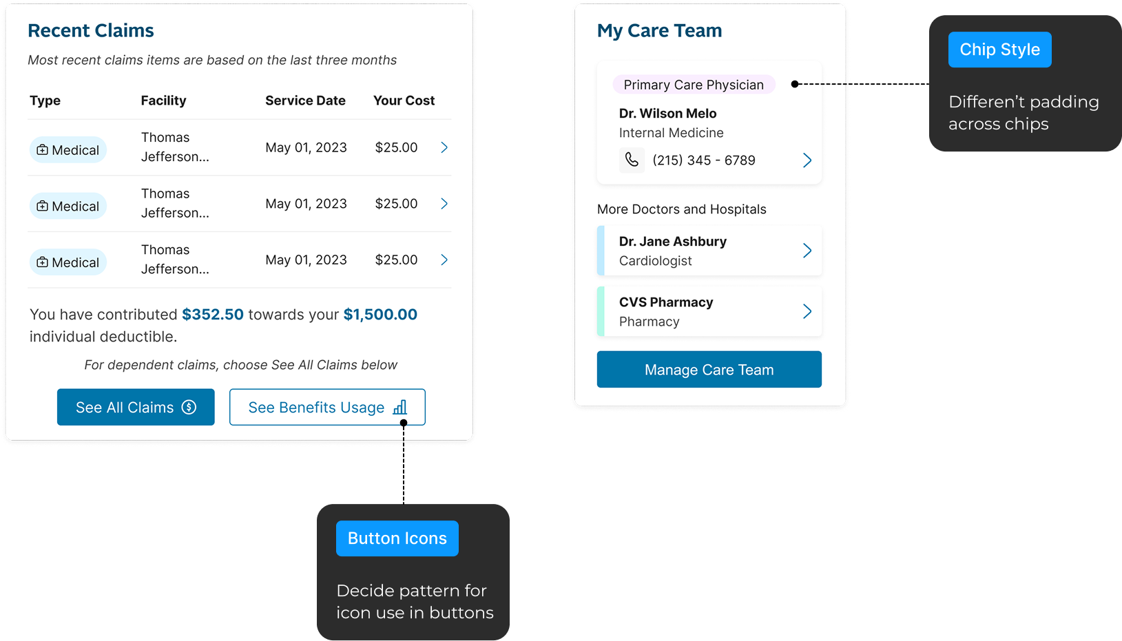
- Component Audit—Collected all existing components to identify duplicates, inconsistencies, navigation disparities, and gaps.
- Workflow Audit—Documented current designer and developer pain points.
Define the Design System
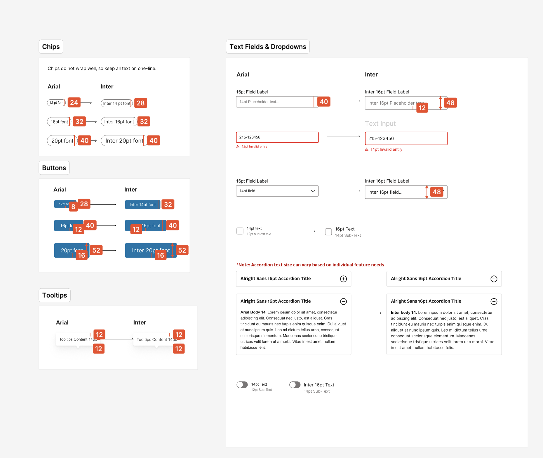
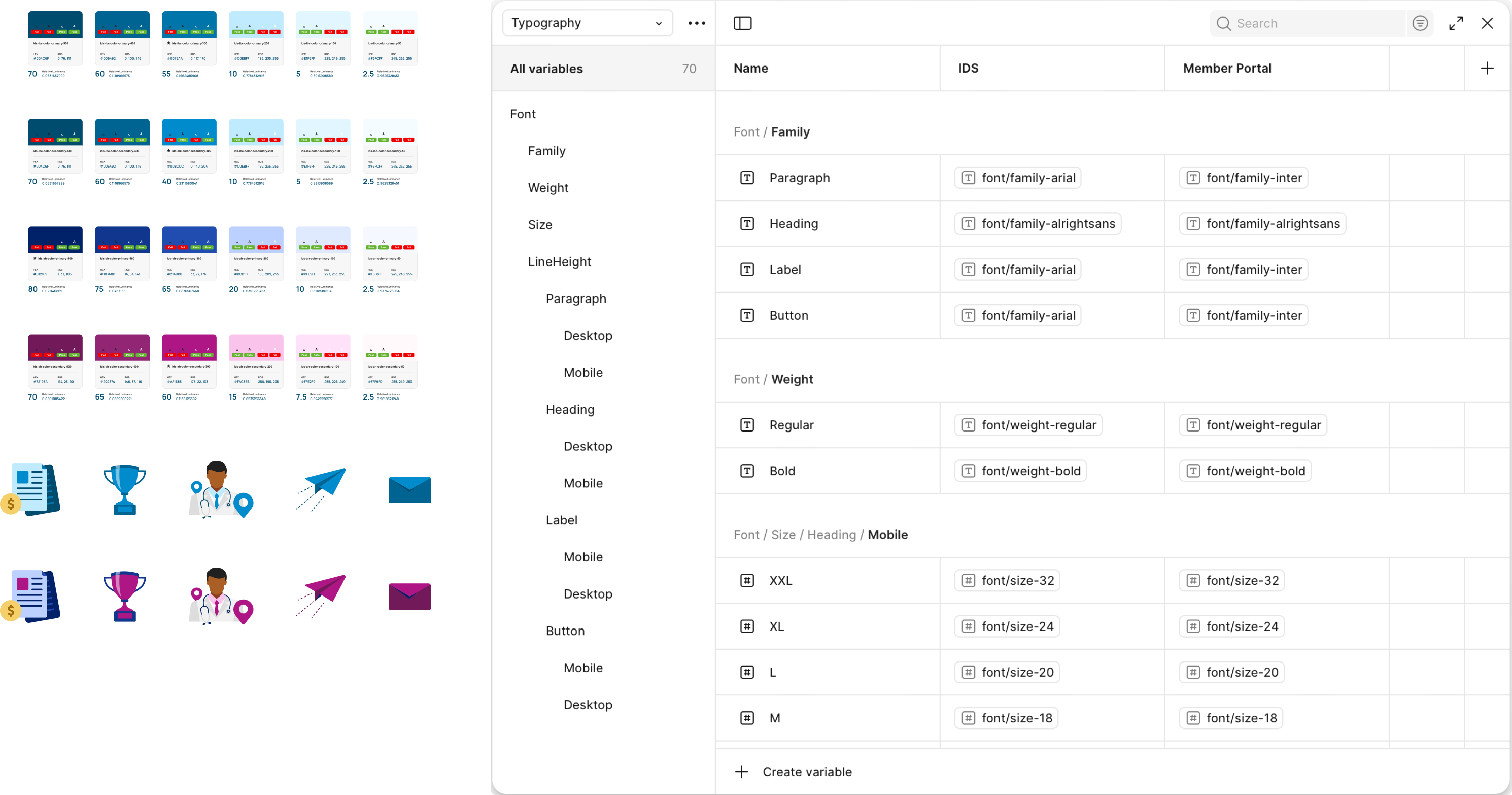
- Design Tokens—Implemented a token architecture for typography and spacing.
- Brand Parity—With the existing brand colors, create variants of certain components to easily swap per brand and reduce manual styling.
- Navigation Patterns—Standardize core flows (stepper forms, redirection modals) into reusable templates.
Build a Living Documentation Hub
- Centralize specs, states, guidelines, and edge cases.
- Establish governance rules for ongoing updates.
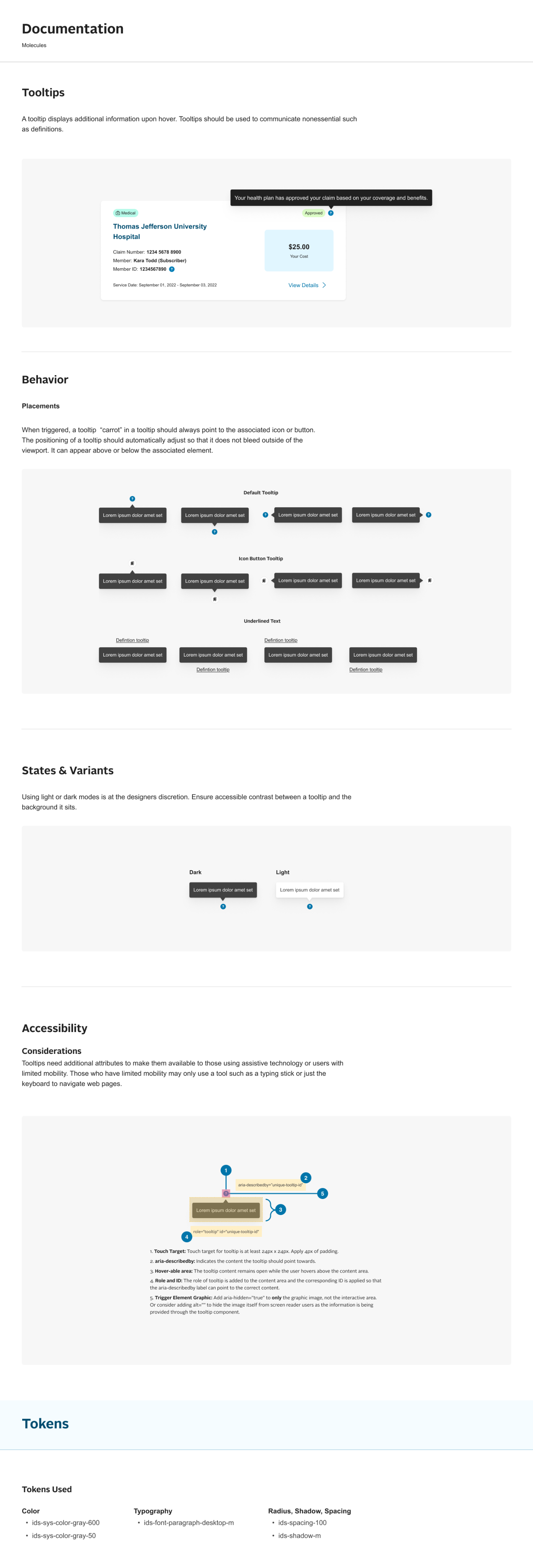
— process

Discovery & Audit
- Examine font choices and sizes for readability and brand consistency.
- Review buttons, input fields, and other form elements for ease of use and clarity.
- Identify points where users get stuck or drop off during a key task or workflow
- Verify that components and actions behave predictably across the entire product
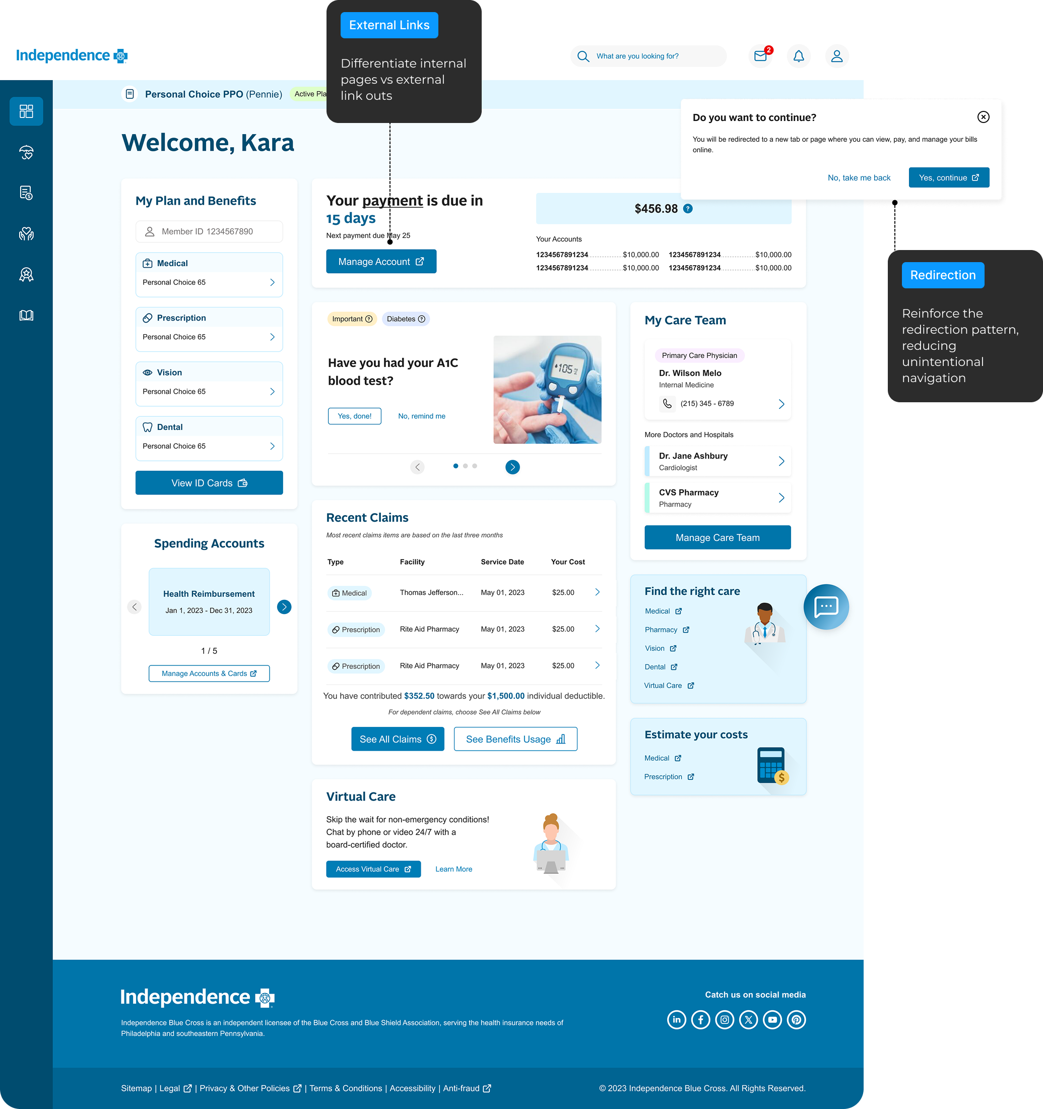
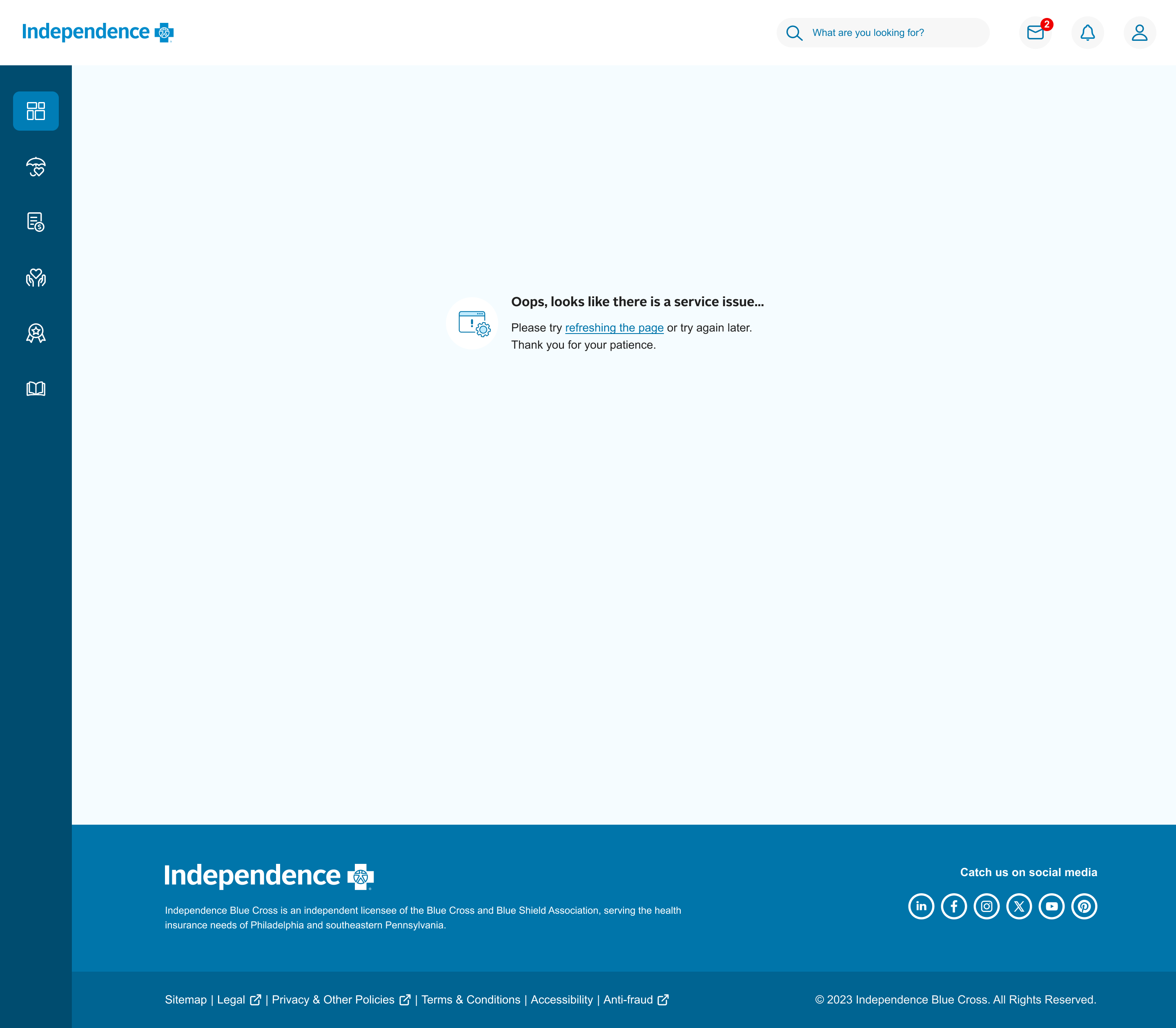
API Errors
Provide clarity, guidance, and a path to resolution


- Identify pain points for designers, developers, and members
Some typography isn’t full tokenized, making for manual overrides.
Inconsistent patterns for forms, date pickers, tabs, and filters.
Inconsistent hover, focus, active, and error states, or missing altogether.
Some components don’t allow variations, like icon placement, label size.
Designers
Too many design variants make code harder to maintain.
Missing states, sometimes have to guess interactions or ask the designer to create it.
Poorly applied tokens forces devs to hardcode brand values.
Developers
Confusion on why they are leaving the portal to complete a task
Inconsistent use of error and empty states, causing distrust in the portal, and calling CS.
Members
Component Design & Tokenization
- Broke down UI elements into atoms, molecules, and organisms.
- Defined design tokens (color, spacing, typography) that could scale across platforms.
- Tested for usability and accessibility
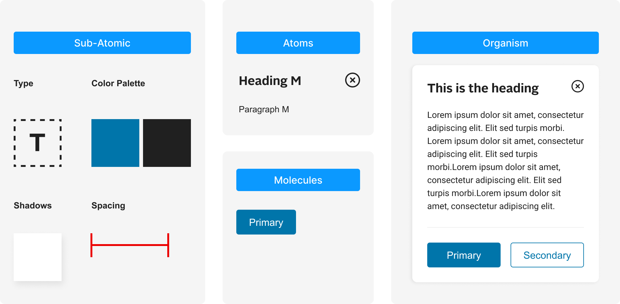

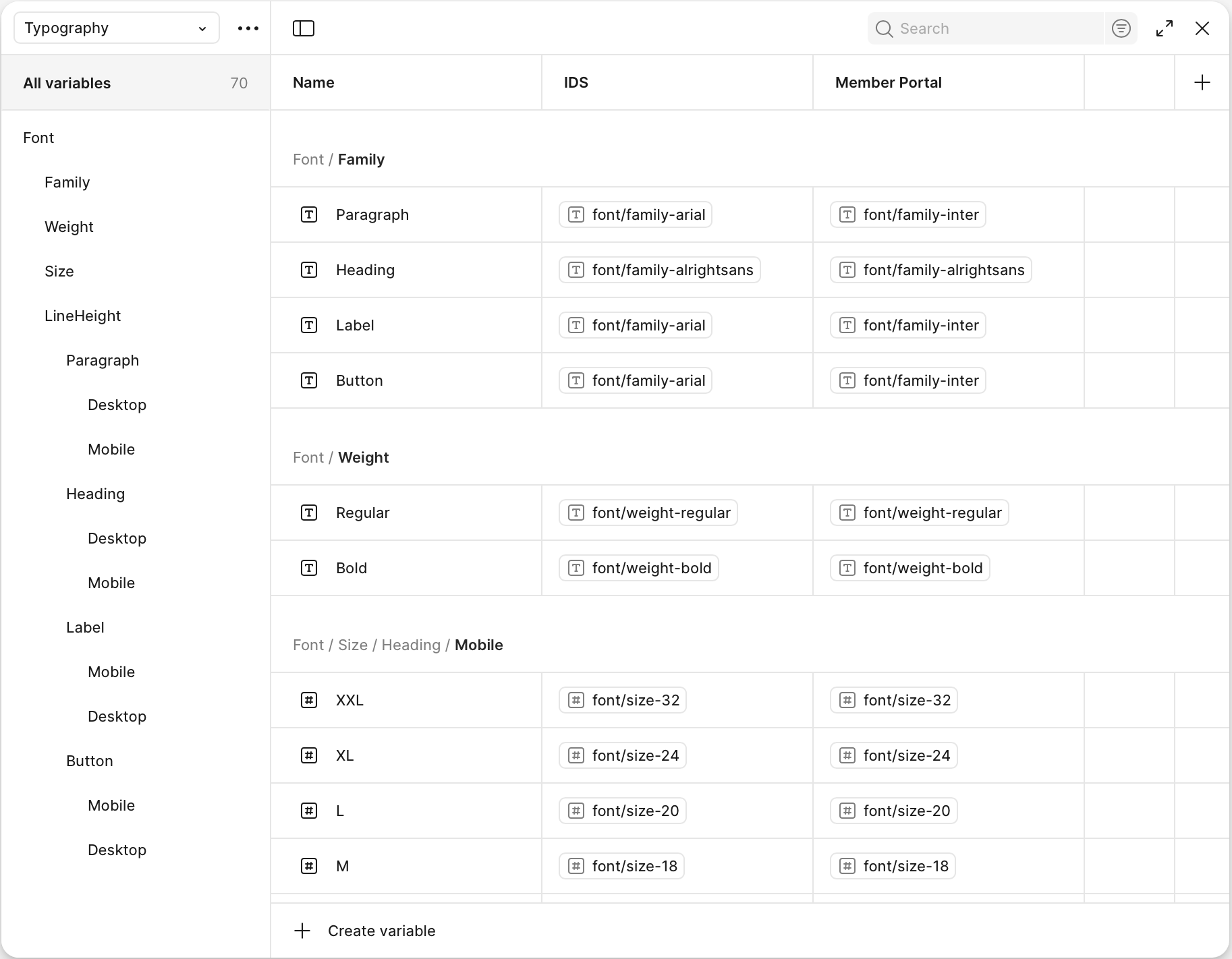
Built a living documentation site with:
- Usage guidelines
- Do’s and Don’ts
- Accessibility notes
- Provided examples of brand variants (Independence vs AmeriHealth) within one system.
Refinement
- Iterated on terminology, visual hierarchy, and guided task prompts
- Validated against compliance and accessibility requirements before handoff
— Outcome
Reduction in time spent
Creating new components and manual overrides.
40-60% of the work day
Reduced Customer Service Calls
Regarding confusing information.

— next steps
Scale & Maintain
The system now allows for continued component upgrades as new needs emerged. A governance process is in place so designers could propose additions and ensure quality.


— IBX Member Portal design system
Redesigning member portal with a scalable design system that standardized patterns and components
Sped up multi-team production and reduced customer service calls
Role
UX Strategist
Implementation Lead & Scaler
Product Designer
Platform
Desktop Web App
Mobile Web
Cross-functional Teams
Product
Development
Marketing
— Overview
Independence Blue Cross (IBX) needed a scalable, consistent way to deliver digital experiences across their member-facing web products. I contributed to evolving and expanding an existing design system—refining components, improving documentation, and enabling designers and developers to work more efficiently.
We needed to deliver a system that supports 1:1 component parity across all Independence and AmeriHealth brands.
The result was a shared library of UI patterns and guidelines that accelerated delivery and ensured a cohesive experience for all members.
— the problem

Slow design and development cycles
Teams repeatedly built similar components from scratch across brands, with no 1:1 parity. This led to longer handoffs, and redundant work.
Limited documentation and knowledge sharing
Team members had to hunt through files, emails and messages to find specs.
Knowledge was silo’d, making scaling efforts across teams difficult. Teams lacked living documentation to guide consistent navigation and component parity.

Inconsistent member experience
Members faced inconsistent navigation and UI, making it difficult to navigate the portal and trust and use the portal with ease.
— Opportunity
How might we create a system that supports
multi-brand styling
consistent patterns,
and
streamlines
development
Slow
Faster
Designers and Developers need a consistent library and semantic naming to easily theme brand experiences.
Limited
Efficient
Teams need a living documentation hub that explains usage, states, navigation patterns, and edge cases for each component.
Inconsistent
Consistent
Members need seamless, reliable navigation and a unified look and feel to complete tasks with confidence.
— Strategy
Core Principles
We grounded our solution in a set of guiding principles:
- Parity—Ensure 1:1 component alignment across brands.
- Scalability—Create a reusable foundation through libraries and tokens to support multiple brands.
- Consistency—Deliver predictable navigation patterns and UI.
- Efficiency—Reduce duplicate work and accelerate delivery with a single source of truth.
- Accessibility—Meet WCAG 2.2 AA standards to ensure usability for all members.

Conduct Audit
- Component Audit—Collected all existing components to identify duplicates, inconsistencies, navigation disparities, and gaps.
- Workflow Audit—Documented current designer and developer pain points.
Define the Design System
- Design Tokens—Implemented a token architecture for typography and spacing.
- Brand Parity—With the existing brand colors, create variants of certain components to easily swap per brand and reduce manual styling.
- Navigation Patterns—Standardize core flows (stepper forms, redirection modals) into reusable templates.
Build a Living Documentation Hub
- Centralize specs, states, guidelines, and edge cases.
- Establish governance rules for ongoing updates.
— process
Discovery & Audit
- Examine font choices and sizes for readability and brand consistency.
- Review buttons, input fields, and other form elements for ease of use and clarity.
- Identify points where users get stuck or drop off during a key task or workflow
- Verify that components and actions behave predictably across the entire product
API Errors
Provide clarity, guidance, and a path to resolution


- Identify pain points for designers, developers, and members
Some typography isn’t full tokenized, making for manual overrides.
Inconsistent patterns for forms, date pickers, tabs, and filters.
Inconsistent hover, focus, active, and error states, or missing altogether.
Some components don’t allow variations, like icon placement, label size.
Designers
Too many design variants make code harder to maintain.
Missing states, sometimes have to guess interactions or ask the designer to create it.
Poorly applied tokens forces devs to hardcode brand values.
Developers
Confusion on why they are leaving the portal to complete a task
Inconsistent use of error and empty states, causing distrust in the portal, and calling CS.
Members
Component Design & Tokenization
- Broke down UI elements into atoms, molecules, and organisms.
- Defined design tokens (color, spacing, typography) that could scale across platforms.
- Tested for usability and accessibility
Built a living documentation site with:
- Usage guidelines
- Do’s and Don’ts
- Accessibility notes
- Provided examples of brand variants (Independence vs AmeriHealth) within one system.
Refinement
- Iterated on terminology, visual hierarchy, and guided task prompts
- Validated against compliance and accessibility requirements before handoff
— Outcome
Reduction in time spent
Creating new components and manual overrides.
40-60% of the work day
Reduced Customer Service Calls
Regarding confusing information.
— next steps
Scale & Maintain
The system now allows for continued component upgrades as new needs emerged. A governance process is in place so designers could propose additions and ensure quality.
— IBX Member Portal design system
Redesigning member portal with a scalable design system that standardized patterns and components
Sped up multi-team production and reduced customer service calls
Role
UX Strategist
Implementation Lead & Scaler
Product Designer
Platform
Desktop Web App
Mobile Web
Cross-functional Teams
Product
Development
Marketing
— Overview
Independence Blue Cross (IBX) needed a scalable, consistent way to deliver digital experiences across their member-facing web products. I contributed to evolving and expanding an existing design system—refining components, improving documentation, and enabling designers and developers to work more efficiently.
We needed to deliver a system that supports 1:1 component parity across all Independence and AmeriHealth brands.
The result was a shared library of UI patterns and guidelines that accelerated delivery and ensured a cohesive experience for all members.
— the problem

Slow design and development cycles
- Teams repeatedly built similar components from scratch across brands, with no 1:1 parity. This led to longer handoffs, and redundant work.

Limited documentation and knowledge sharing
- Team members had to hunt through files, emails and messages to find specs.
- Knowledge was silo’d, making scaling efforts across teams difficult. Teams lacked living documentation to guide consistent navigation and component parity.

Inconsistent member experience
- Members faced inconsistent navigation and UI, making it difficult to navigate the portal and trust and use the portal with ease.
— Opportunity
How might we create a system that supports
multi-brand styling,
establishes consistent patterns,
and
streamlines development?
Slow
Faster
Designers and Developers need a consistent library and semantic naming to easily theme brand experiences.
Limited
Efficient
Teams need a living documentation hub that explains usage, states, navigation patterns, and edge cases for each component.
Inconsistent
Consistent
Members need seamless, reliable navigation and a unified look and feel to complete tasks with confidence.
— Strategy
Core Principles
We grounded our solution in a set of guiding principles:
- Parity—Ensure 1:1 component alignment across brands.
- Scalability—Create a reusable foundation through libraries and tokens to support multiple brands.
- Consistency—Deliver predictable navigation patterns and UI.
- Efficiency—Reduce duplicate work and accelerate delivery with a single source of truth.
- Accessibility—Meet WCAG 2.2 AA standards to ensure usability for all members.

Conduct Audit
- Component Audit—Collected all existing components to identify duplicates, inconsistencies, navigation disparities, and gaps.
- Workflow Audit—Documented current designer and developer pain points.
Define the Design System
- Design Tokens—Implemented a token architecture for typography and spacing.
- Brand Parity—With the existing brand colors, create variants of certain components to easily swap per brand and reduce manual styling.
- Navigation Patterns—Standardize core flows (stepper forms, redirection modals) into reusable templates.
Build a Living Documentation Hub
- Centralize specs, states, guidelines, and edge cases.
- Establish governance rules for ongoing updates.
— process
Discovery & Audit
- Examine font choices and sizes for readability and brand consistency.
- Review buttons, input fields, and other form elements for ease of use and clarity.
- Identify points where users get stuck or drop off during a key task or workflow
- Verify that components and actions behave predictably across the entire product
API Errors
Provide clarity, guidance, and a path to resolution


- Identify pain points for designers, developers, and members
Some typography isn’t full tokenized, making for manual overrides.
Inconsistent patterns for forms, date pickers, tabs, and filters.
Inconsistent hover, focus, active, and error states, or missing altogether.
Some components don’t allow variations, like icon placement, label size.
Designers
Too many design variants make code harder to maintain.
Missing states, sometimes have to guess interactions or ask the designer to create it.
Poorly applied tokens forces devs to hardcode brand values.
Developers
Confusion on why they are leaving the portal to complete a task
Inconsistent use of error and empty states, causing distrust in the portal, and calling CS.
Members
Component Design & Tokenization
- Broke down UI elements into atoms, molecules, and organisms.
- Defined design tokens (color, spacing, typography) that could scale across platforms.
- Tested for usability and accessibility
Built a living documentation site with:
- Usage guidelines
- Do’s and Don’ts
- Accessibility notes
- Provided examples of brand variants (Independence vs AmeriHealth) within one system.
Refinement
- Iterated on terminology, visual hierarchy, and guided task prompts
- Validated against compliance and accessibility requirements before handoff
— Outcome
Reduction in time spent
Creating new components and manual overrides.
40-60% of the work day
Reduced Customer Service Calls
Regarding confusing information.

— next steps
Scale & Maintain
The system now allows for continued component upgrades as new needs emerged. A governance process is in place so designers could propose additions and ensure quality.