

— IBX privacy disclosures
Simplifying complex compliance tasks
Sped up manual processes into an efficient, user-friendly system
Role
UX Strategist
Sr UX Designer
Design System Architect
Platform
Desktop App
Cross-functional Teams
Privacy Team
Development

— Overview
Managing privacy disclosures is a highly regulated, detail-heavy process at IBX. Teams across departments needed a centralized way to track, manage, and document disclosures with accuracy, compliance, and security. Previously, workflows were fragmented, leading to duplicate work, upload errors, and uncertainty about task completion status.
As Sr. UX Designer, I led the design of the Privacy Disclosure Dashboard — a tool that simplifies complex compliance workflows into a clear, action-oriented interface for compliance officers, administrators, and contributors.
— the problem
Fragmented Processes
- Disclosures were tracked manually across different systems, creating inefficiencies.

Data Inconsistencies
- Errors in uploads and mismatched member counts caused delays in publishing.

Lack of Visibility
- Teams couldn’t easily see task progress (how many members were complete vs. pending vs. published.
— Opportunity
How might we transform fragmented compliance into a
consistent patterns,
streamlines
development
Siloed

Status at a glance
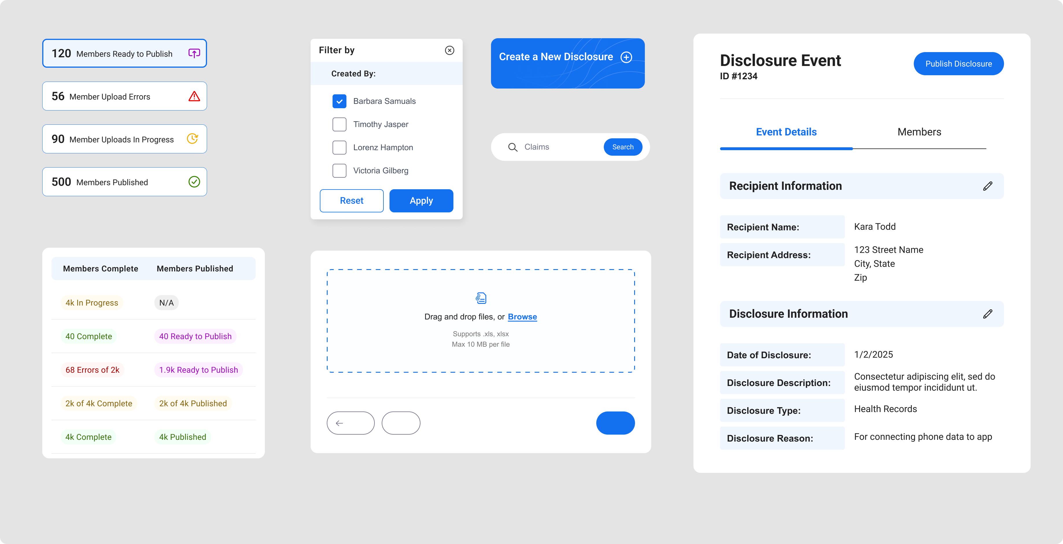
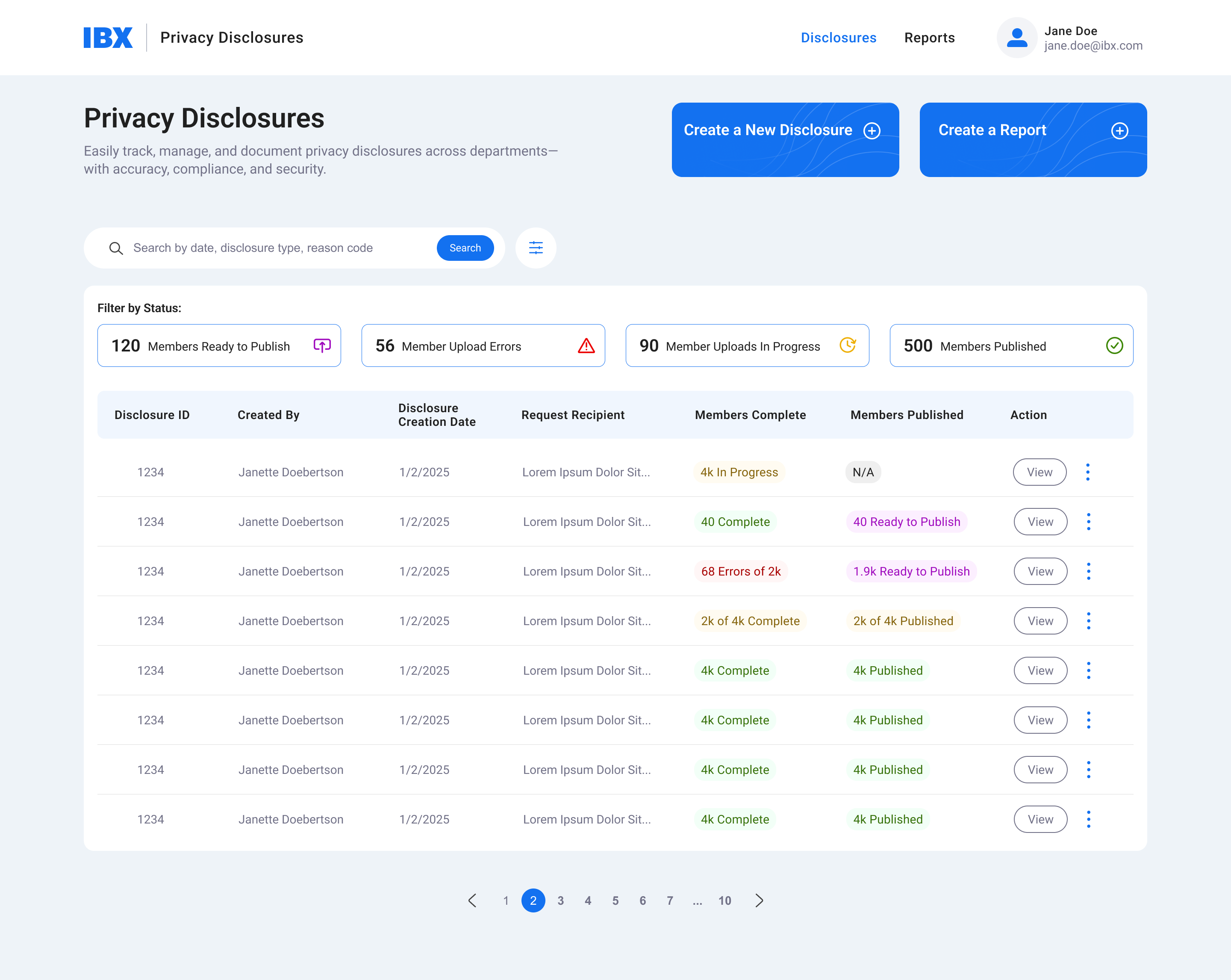
A high-level summary (Members Ready to Publish, Upload Errors, Uploads in Progress, Members Published)
Hidden
Error visibility
Upload issues are surfaced early, preventing compliance delays.
Unclear
Audit-friendly design
Each disclosure record tracks who created it, dates, recipient groups, and publishing status.
— Strategy
Process Outline
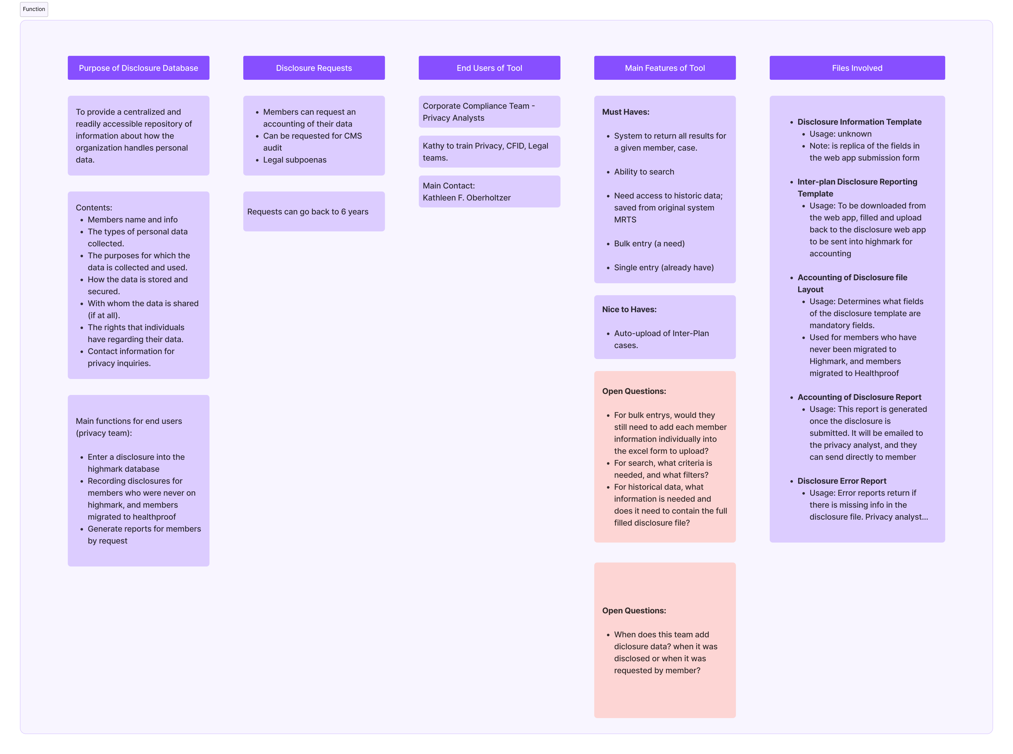
- Discovery & Audit—Interviewed compliance officers to understand workflows, pain points, and gaps.
- Workflow Mapping—Documented end-to-end disclosure lifecycle (creation > upload > member compliance > publishing)
- Information Architecture—Reorganized data tables and dashboards to surface the most critical metrics first.
- Iteration—Designed and tested dashboard layouts that balanced detail with clarity.
— process

Compliance officers interviews
- The team suffered from a truly complex flow, jumping between various systems to complete a single task, which included many member use cases and various lines of business.
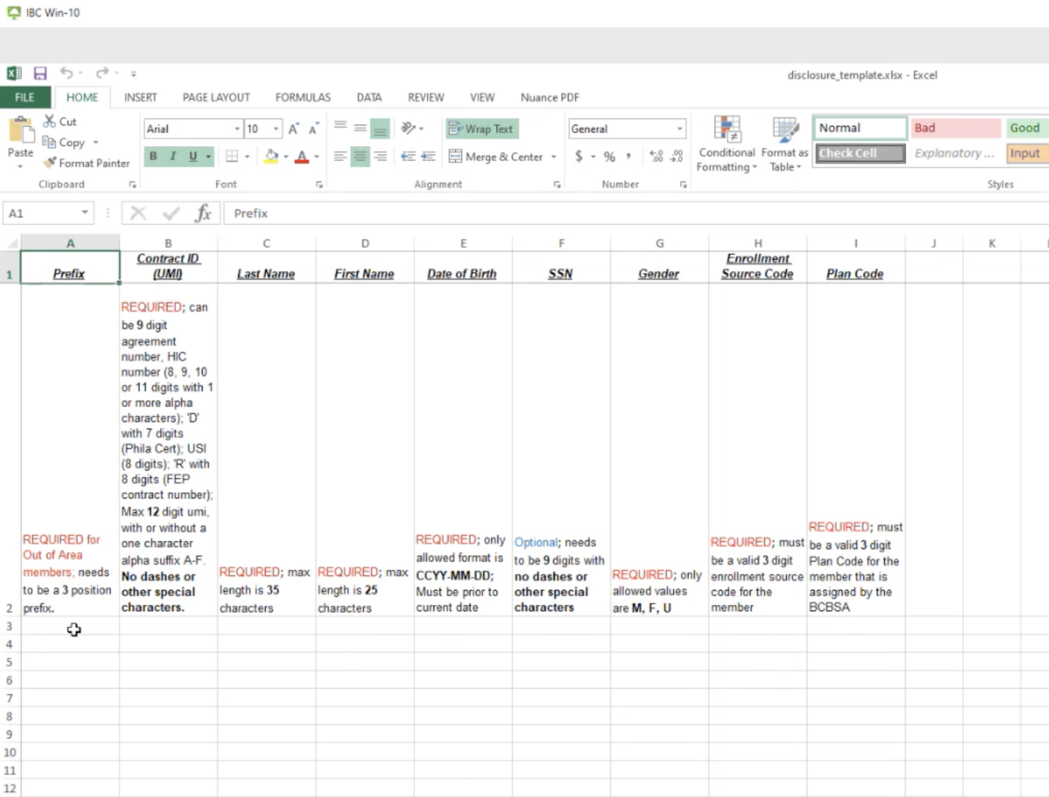
- Compliance officers were manually inputting 1,000s of individual members data, and keeping records on their individual computers.
Blurred for privacy
Workflow Mapping
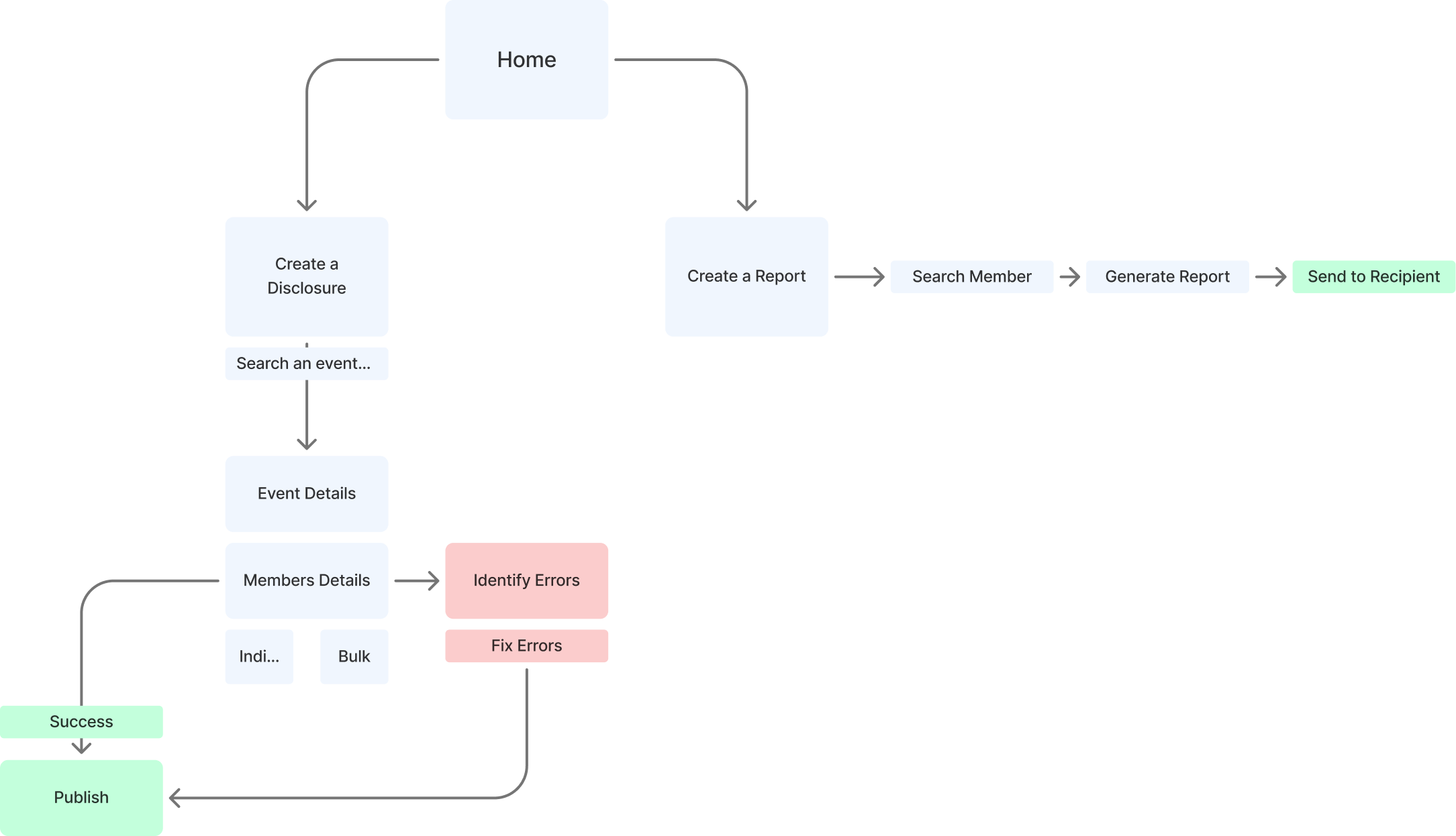
- The new mapping took the team from a 8+ step process (depending on member and line of business) to a 3-4 step process.
Information Architecture & user feedback loop
- I met with the privacy teams on many occasions to understand more data complexities, validate flows, and ensure their end-goals would be met.
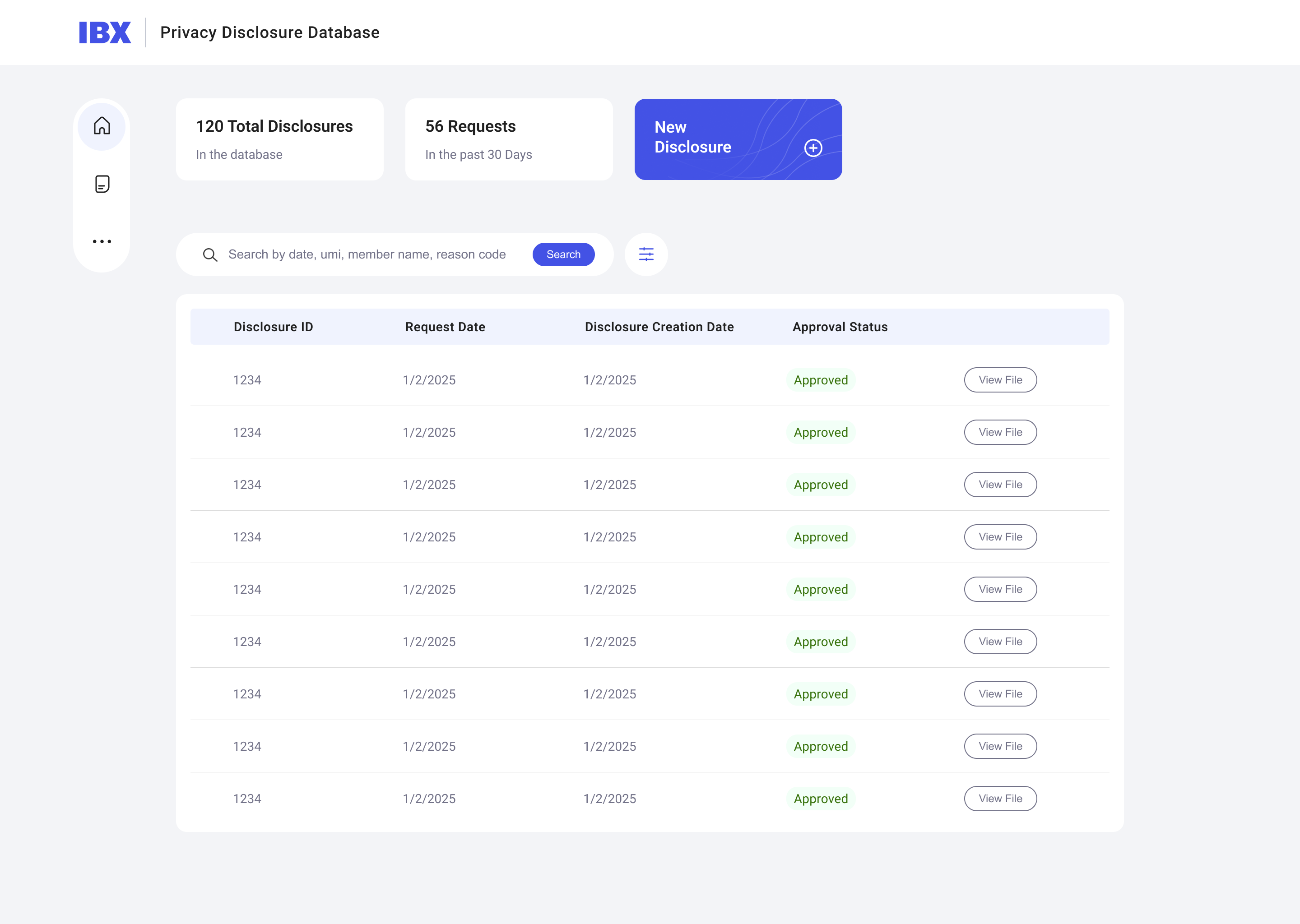
Homepage Iterations - before and after user feedback
- The first iteration had a side menu, but the users didn’t feel that the menu items would expand beyond two items. Therefore, I moved to a clear text header menu, with an SSO account login.
- The top metrics became a filterable metric system, to allow the team more visibility and control.
- After learning what data and APIs we have available, i was able to expand more on the data table itself.
Reducing manual tasks
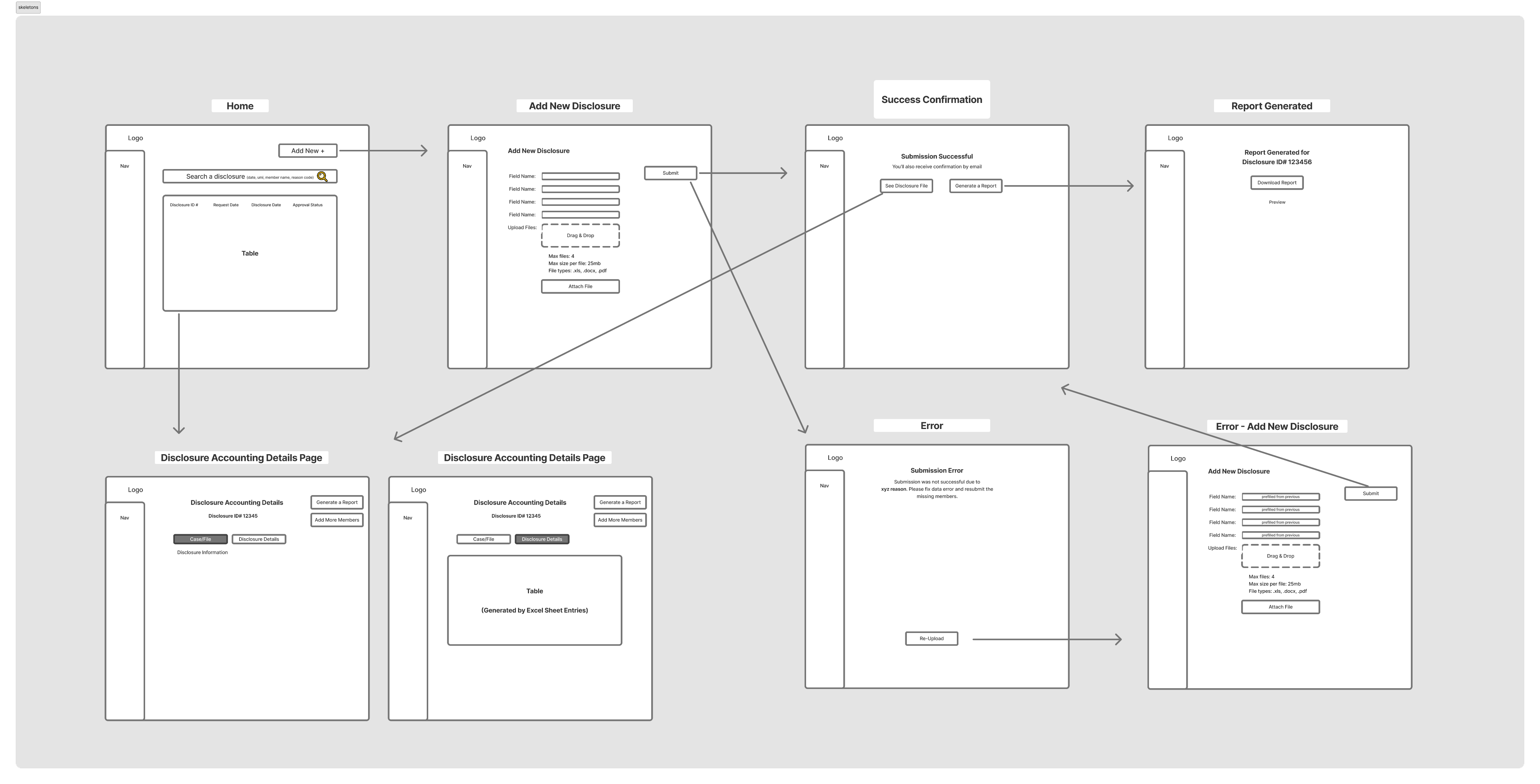
- What once were individual excel documents, are now easily in digital field format in a simple 3-step system.
Finding error early on
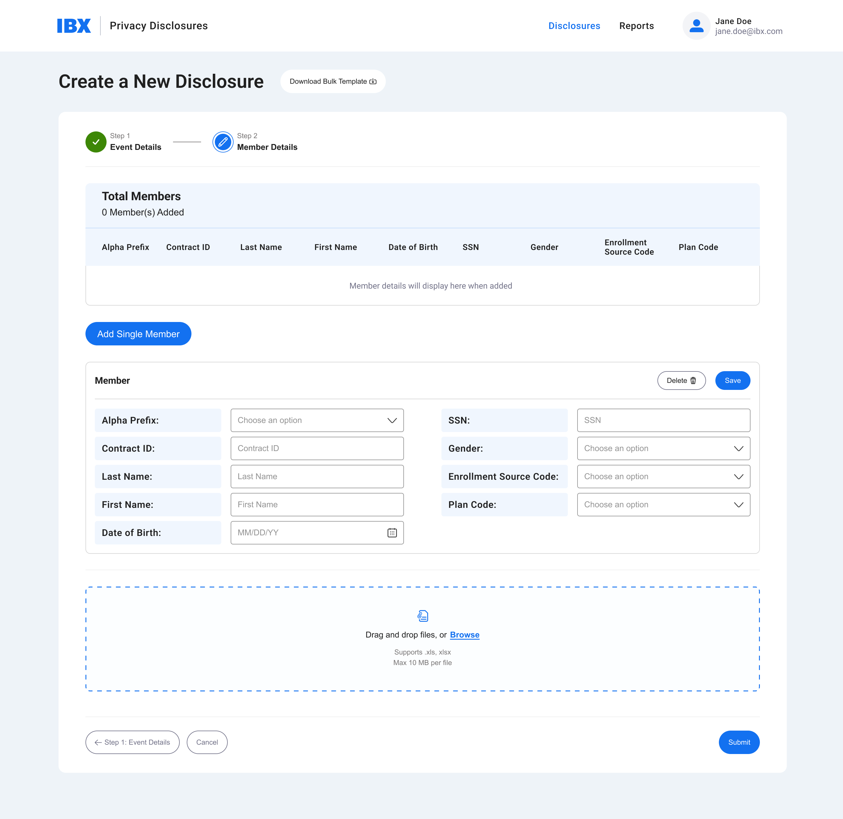
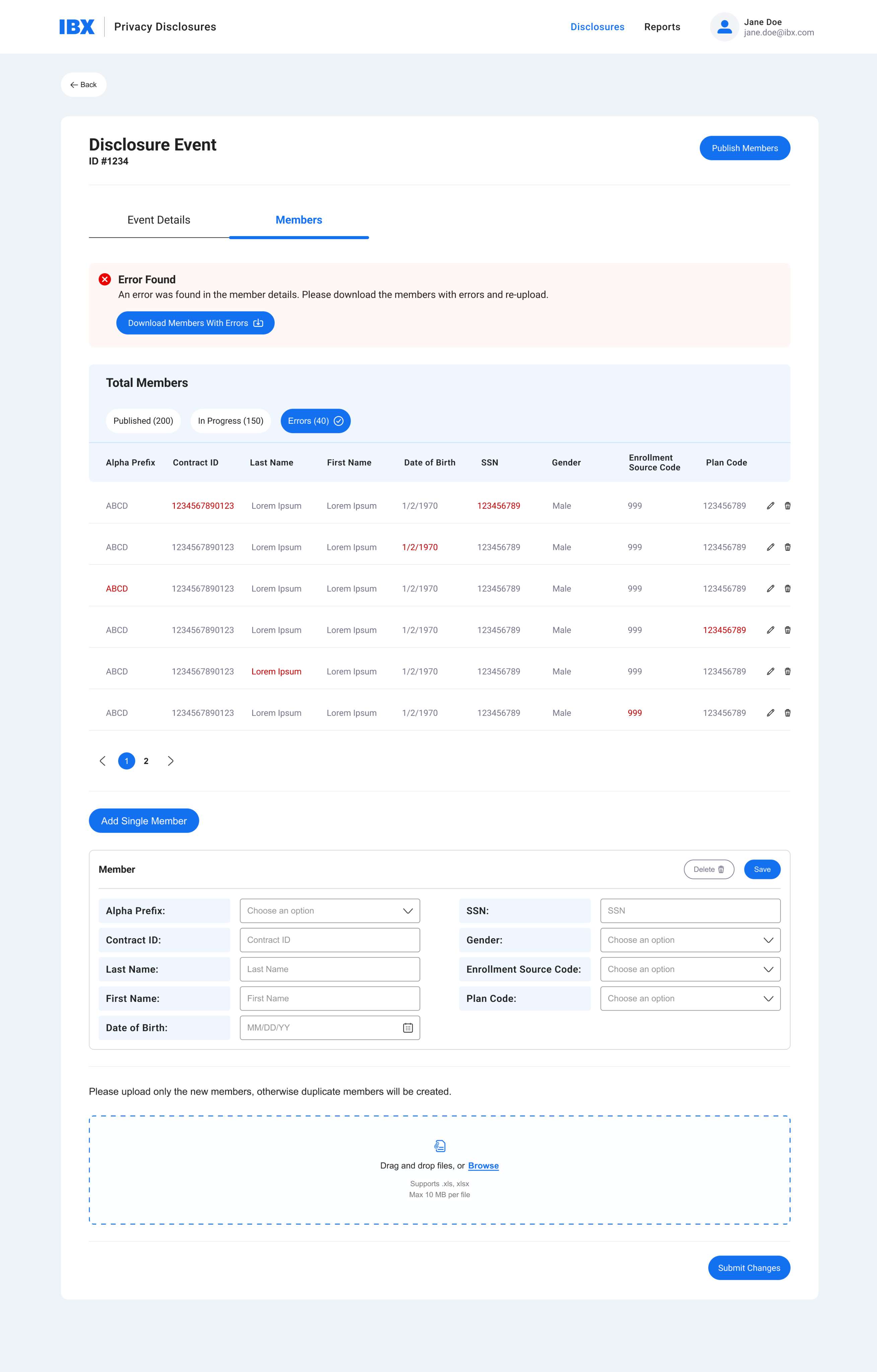
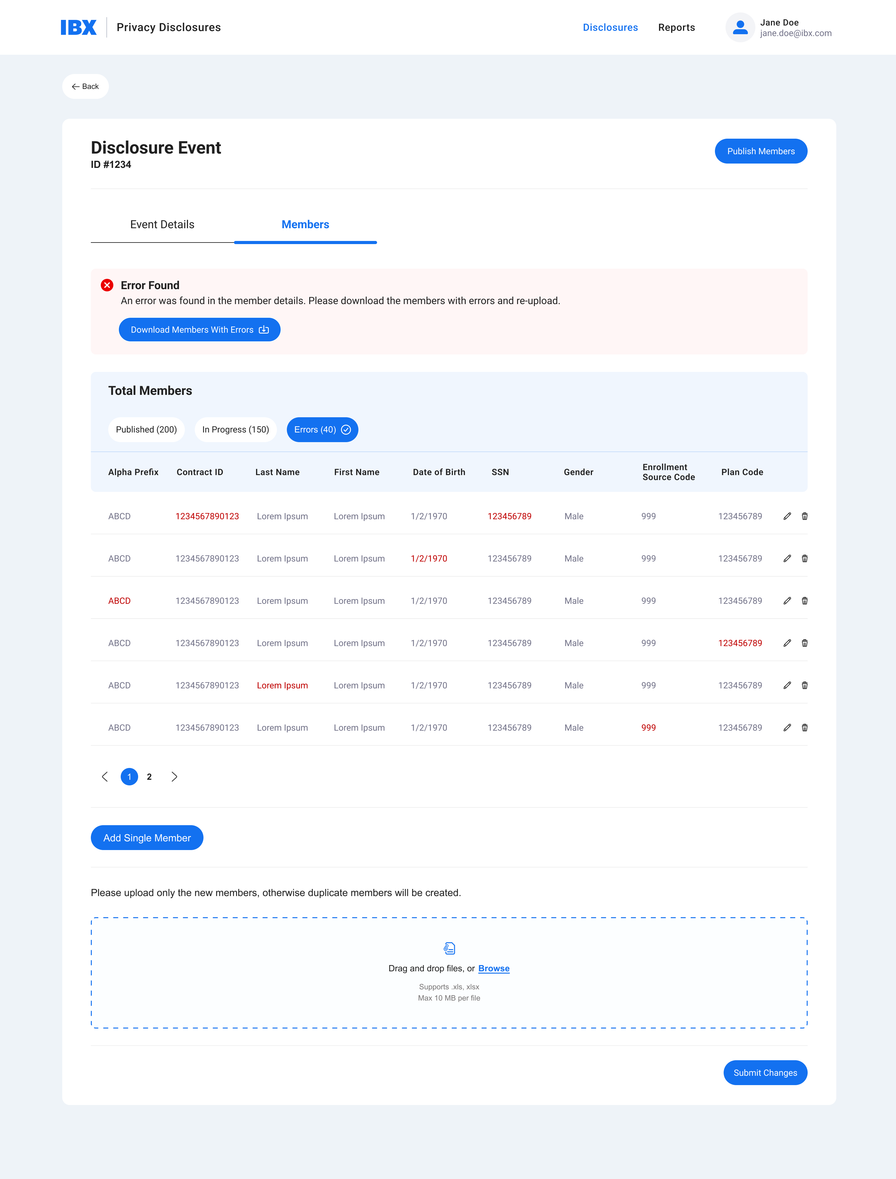
- Previously, users had to wait hours to days for the system to identify errors in member details, and be notified by email—then, start the multi-step processes again. With the upgraded design, they could view errors on screen and correct them early, by clicking the edit icon and having the edit module appear as shown below.
- The new system also allowed for individual inputs as well as bulk uploads.
Refinement
- Iterated on terminology, visual hierarchy, and guided task prompts
- Validated against compliance and accessibility requirements before handoff
— Outcome
Reduced manual errors
by surfacing upload issues in real-time.
Faster workflows
Compliance teams could publish disclosures with confidence, reducing back-and-forth.
Increased visibility
All stakeholders could monitor disclosure status at a glance.

— next steps
This project showcased how UX can transform a compliance-heavy, complex workflow, into a simplified, action-driven experience. By reducing cognitive load and surfacing the right data at the right time, the dashboard helped teams move from reactive compliance to proactive oversight.


— IBX privacy disclosures
Simplifying complex compliance tasks
Sped up manual processes into an efficient, user-friendly system
Role
UX Strategist
Sr UX Designer
Design System Architect
Platform
Desktop App
Cross-functional Teams
Privacy Team
Development
— Overview
Managing privacy disclosures is a highly regulated, detail-heavy process at IBX. Teams across departments needed a centralized way to track, manage, and document disclosures with accuracy, compliance, and security. Previously, workflows were fragmented, leading to duplicate work, upload errors, and uncertainty about task completion status.
As Sr. UX Designer, I led the design of the Privacy Disclosure Dashboard — a tool that simplifies complex compliance workflows into a clear, action-oriented interface for compliance officers, administrators, and contributors.
— the problem
Fragmented Processes
- Disclosures were tracked manually across different systems, creating inefficiencies.
Data Inconsistencies
- Errors in uploads and mismatched member counts caused delays in publishing.

Lack of Visibility
- Teams couldn’t easily see task progress (how many members were complete vs. pending vs. published.
— Opportunity
How might we transform fragmented compliance into a
consistent patterns,
streamlines
development
Siloed
Status at a glance
A high-level summary (Members Ready to Publish, Upload Errors, Uploads in Progress, Members Published)
Hidden
Error visibility
Upload issues are surfaced early, preventing compliance delays.
Unclear
Audit-friendly design
Each disclosure record tracks who created it, dates, recipient groups, and publishing status.
— Strategy
Process Outline
- Discovery & Audit—Interviewed compliance officers to understand workflows, pain points, and gaps.
- Workflow Mapping—Documented end-to-end disclosure lifecycle (creation > upload > member compliance > publishing)
- Information Architecture—Reorganized data tables and dashboards to surface the most critical metrics first.
- Iteration—Designed and tested dashboard layouts that balanced detail with clarity.
— process
Compliance officers interviews
- The team suffered from a truly complex flow, jumping between various systems to complete a single task, which included many member use cases and various lines of business.
- Compliance officers were manually inputting 1,000s of individual members data, and keeping records on their individual computers.
Blurred for privacy
Workflow Mapping
- The new mapping took the team from a 8+ step process (depending on member and line of business) to a 3-4 step process.
Information Architecture & user feedback loop
- I met with the privacy teams on many occasions to understand more data complexities, validate flows, and ensure their end-goals would be met.
Homepage Iterations - before and after user feedback
- The first iteration had a side menu, but the users didn’t feel that the menu items would expand beyond two items. Therefore, I moved to a clear text header menu, with an SSO account login.
- The top metrics became a filterable metric system, to allow the team more visibility and control.
- After learning what data and APIs we have available, i was able to expand more on the data table itself.
Reducing manual tasks
- What once were individual excel documents, are now easily in digital field format in a simple 3-step system.
Finding error early on
- Previously, users had to wait hours to days for the system to identify errors in member details, and be notified by email—then, start the multi-step processes again. With the upgraded design, they could view errors on screen and correct them early, by clicking the edit icon and having the edit module appear as shown below.
- The new system also allowed for individual inputs as well as bulk uploads.
Refinement
- Iterated on terminology, visual hierarchy, and guided task prompts
- Validated against compliance and accessibility requirements before handoff
— Outcome
Reduced manual errors
by surfacing upload issues in real-time.
Faster workflows
Compliance teams could publish disclosures with confidence, reducing back-and-forth.
Increased visibility
All stakeholders could monitor disclosure status at a glance.
— next steps
This project showcased how UX can transform a compliance-heavy, complex workflow, into a simplified, action-driven experience. By reducing cognitive load and surfacing the right data at the right time, the dashboard helped teams move from reactive compliance to proactive oversight.
— IBX privacy disclosures
Simplifying complex compliance tasks
Sped up manual processes into an efficient, user-friendly system
Role
UX Strategist
Sr UX Designer
Design System Architect
Platform
Desktop App
Cross-functional Teams
Privacy Team
Development
— Overview
Managing privacy disclosures is a highly regulated, detail-heavy process at IBX. Teams across departments needed a centralized way to track, manage, and document disclosures with accuracy, compliance, and security. Previously, workflows were fragmented, leading to duplicate work, upload errors, and uncertainty about task completion status.
As Sr. UX Designer, I led the design of the Privacy Disclosure Dashboard — a tool that simplifies complex compliance workflows into a clear, action-oriented interface for compliance officers, administrators, and contributors.
— the problem
Fragmented Processes
- Disclosures were tracked manually across different systems, creating inefficiencies.

Data Inconsistencies
- Errors in uploads and mismatched member counts caused delays in publishing.

Lack of Visibility
- Teams couldn’t easily see task progress (how many members were complete vs. pending vs. published.
— Opportunity
How might we transform fragmented compliance into a
streamlined,
transparent experience
Siloed
Status at a glance
A high-level summary (Members Ready to Publish, Upload Errors, Uploads in Progress, Members Published)
Hidden
Error visibility
Upload issues are surfaced early, preventing compliance delays.
Unclear
Audit-friendly design
Each disclosure record tracks who created it, dates, recipient groups, and publishing status.
— Strategy
Process Outline
- Discovery & Audit—Interviewed compliance officers to understand workflows, pain points, and gaps.
- Workflow Mapping—Documented end-to-end disclosure lifecycle (creation > upload > member compliance > publishing)
- Information Architecture—Reorganized data tables and dashboards to surface the most critical metrics first.
- Iteration—Designed and tested dashboard layouts that balanced detail with clarity.
— process
Compliance officers interviews
- The team suffered from a truly complex flow, jumping between various systems to complete a single task, which included many member use cases and various lines of business.
- Compliance officers were manually inputting 1,000s of individual members data, and keeping records on their individual computers.
Blurred for privacy
Workflow Mapping
- The new mapping took the team from a 8+ step process (depending on member and line of business) to a 3-4 step process.
Information Architecture & user feedback loop
- I met with the privacy teams on many occasions to understand more data complexities, validate flows, and ensure their end-goals would be met.
Homepage Iterations - before and after user feedback
- The first iteration had a side menu, but the users didn’t feel that the menu items would expand beyond two items. Therefore, I moved to a clear text header menu, with an SSO account login.
- The top metrics became a filterable metric system, to allow the team more visibility and control.
- After learning what data and APIs we have available, i was able to expand more on the data table itself.
Reducing manual tasks
- What once were individual excel documents, are now easily in digital field format in a simple 3-step system.
Finding error early on
- Previously, users had to wait hours to days for the system to identify errors in member details, and be notified by email—then, start the multi-step processes again. With the upgraded design, they could view errors on screen and correct them early, by clicking the edit icon and having the edit module appear as shown below.
- The new system also allowed for individual inputs as well as bulk uploads.
Refinement
- Iterated on terminology, visual hierarchy, and guided task prompts
- Validated against compliance and accessibility requirements before handoff
— Outcome
Reduced manual errors
by surfacing upload issues in real-time.
Faster workflows
Compliance teams could publish disclosures with confidence, reducing back-and-forth.
Increased visibility
All stakeholders could monitor disclosure status at a glance.

— next steps
This project showcased how UX can transform a compliance-heavy, complex workflow, into a simplified, action-driven experience. By reducing cognitive load and surfacing the right data at the right time, the dashboard helped teams move from reactive compliance to proactive oversight.